
Bluefly
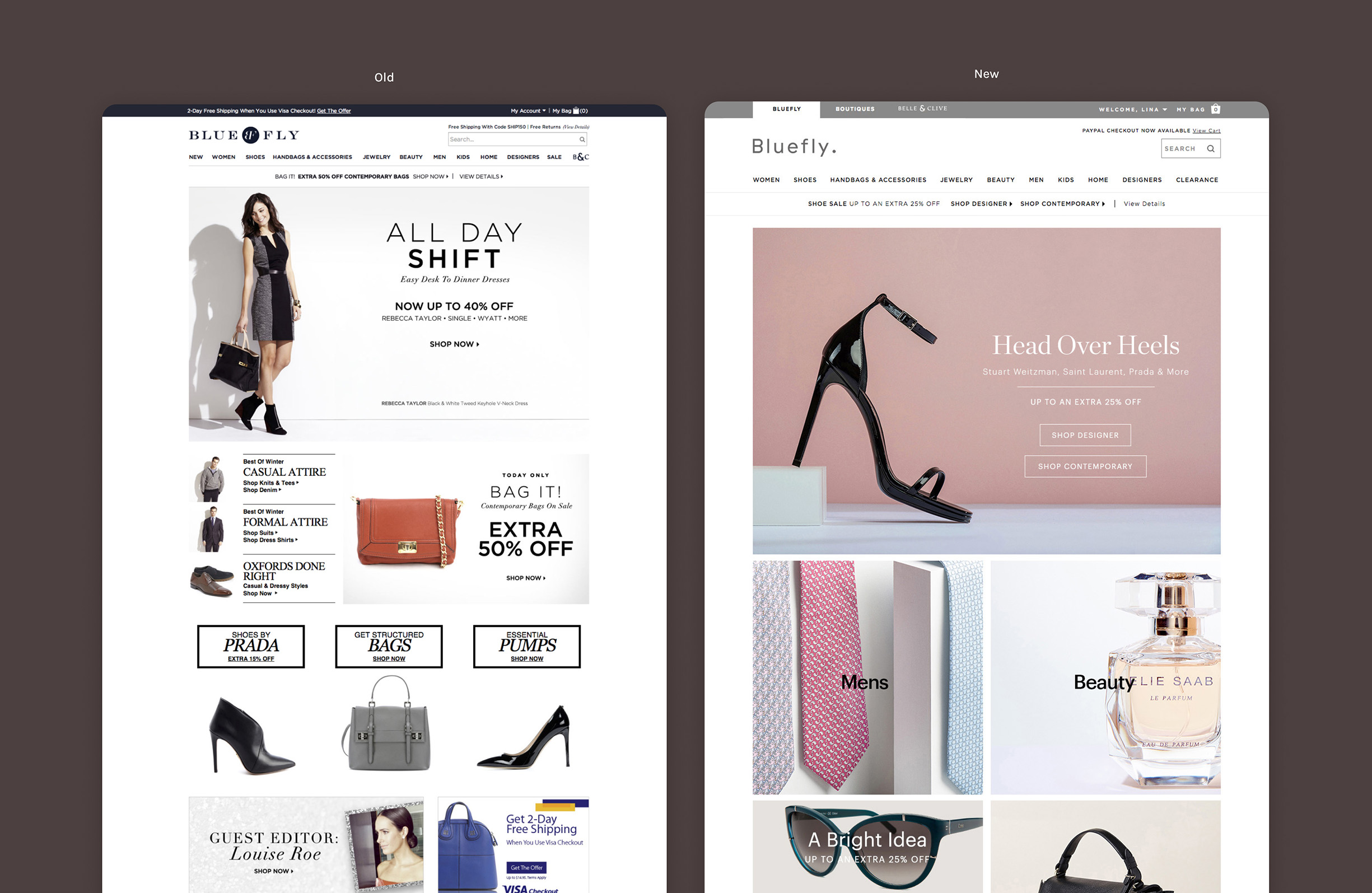
Being one of the first original online retailers in the 90’s (say what?), Bluefly has given online consumers and fashionistas a destination to purchase designer brands at discounted prices. My role at Bluefly was to lead the redesign and rebrand – in tandem, design a responsive interface, re-think usability issues and help address pain points.
The website needed a revamp to improve the user experience and increase traffic. This transition involved a rebrand, the creation of a responsive mobile site, and the development of apps for both iOS and Android. To attract more customers, Bluefly launched a completely new look and feel that was refreshing, minimal, and modern. New templates were created for emails, the homepage, and landing pages. Additionally, Bluefly introduced a new, streamlined checkout system, making it easier for consumers to make global purchases. Features like Visa Checkout, PayPal, and Pay with Amazon were integrated to provide users with secure and convenient payment options.
Personal objectives
- Facilitate a better user experience for Bluefly’s website by improving its UI and new brand guidelines
- Take full ownership of the various roles involved in designing and finalizing our product
- Streamline workflows with engineering, design, merchandising and marketing teams to bridge existing gaps
- Focus on improving the quality of the user’s interaction based on what their needs are

The problem
There were too many promotions running simultaneously, and the homepage lacked visual hierarchy. It was time to rethink the overall strategy and refocus the company’s initiatives.
The challenges
- Site was not responsive
- Constant promotional changes
- Limited asset library
- Inventory & stock issues
- Navigation & other deep linked pages
- Platform restrictions & limitations
Web style guides
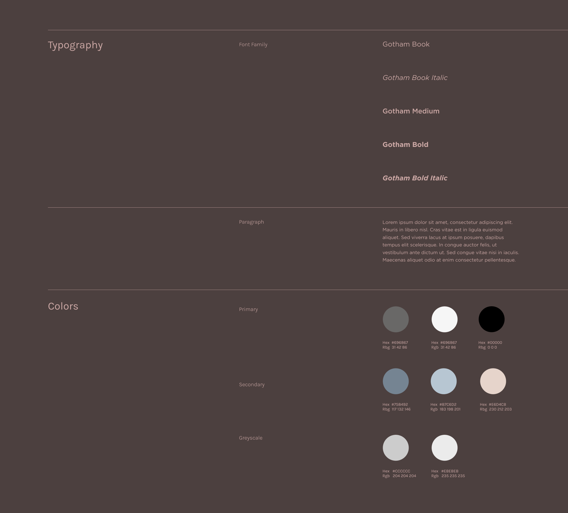
During the rebranding process, I was surprised to find that there was no global web style guide for engineers to follow. Since design systems have now replaced traditional web style guides, I collaborated with the design, engineering, and marketing teams to ensure consistency and quality throughout the design process. Shocking, I know. Major components like buttons, fonts, and colors were inconsistent, and tracking down every style was becoming too time-consuming. This approach wasn't sustainable. The solution was simple: we needed to create a holistic style guide to ensure pixel-perfect designs and keep documentation readily accessible.
This style guide is designed to maintain consistency and quality in the product design process. It provides clear guidelines on visual and content elements, helping to create a cohesive and user-friendly experience.

Research & understanding our customers
I began my case study with a brand analysis of Bluefly by researching what competitors were doing in the market. In targeting our demographics, the decision to rebrand made complete sense. This analysis helped validate what was becoming industry standard and best practice. Bluefly was also an email-driven company, and our users were always on the lookout for new products and promotions.
Target audience demographics
- Ages 26-55
- Loves fashion & shopping (3.5x the average person)
- Habitual spenders
- Urban & pop culture savvy (majority located in New York, Los Angeles, Chicago, Washington D.C., San Francisco)
My Account users
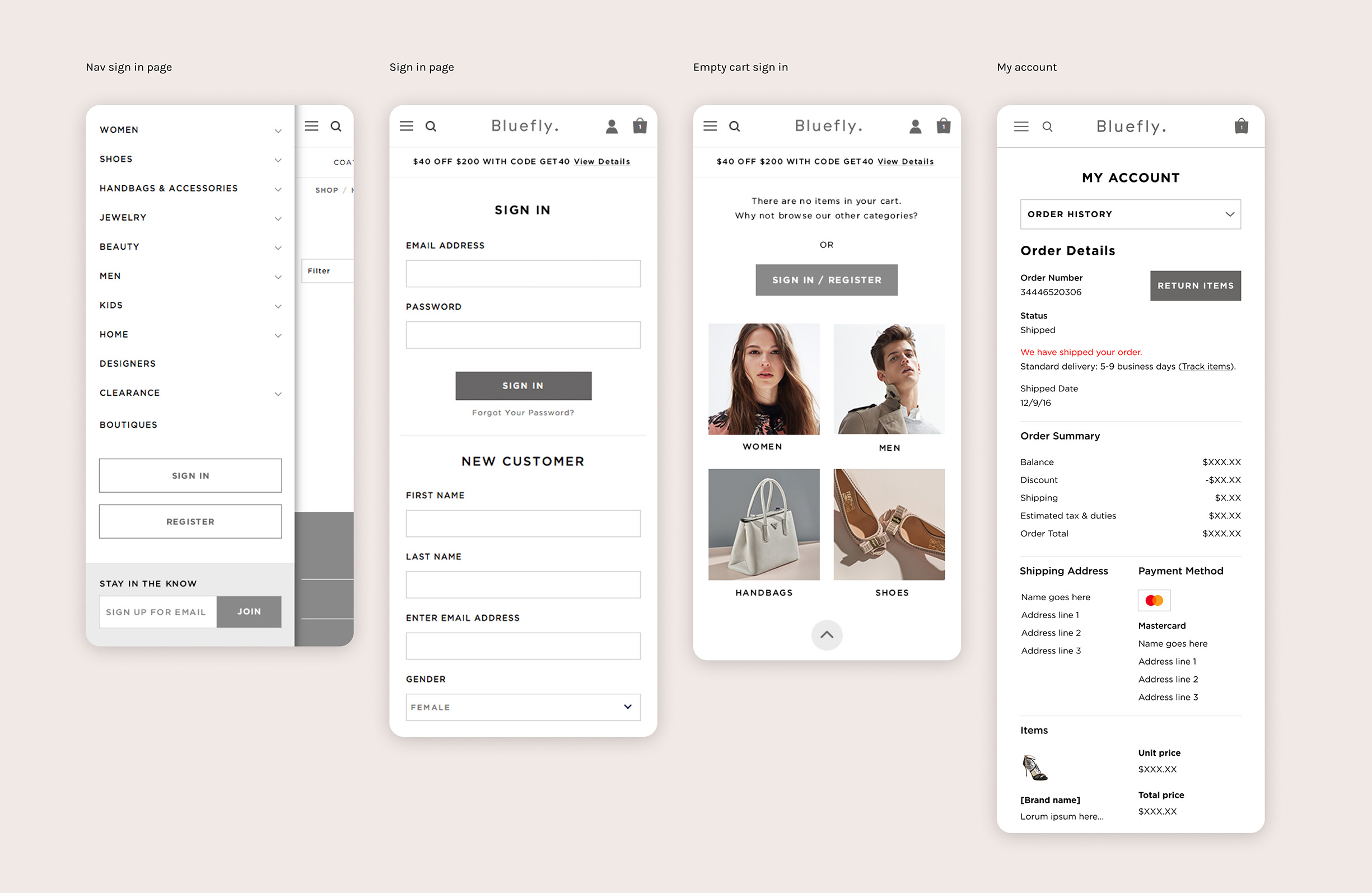
We wanted to make it easy for our customers to sign up and create an account with us. By leveraging our top-funnel metrics, we personalized the experience and ensured account security to keep track of customer data. This approach encouraged users to return and shop with us again.
I updated the UI for the "My Account" section to align with the new brand guidelines. Adding white space and defining headers made navigation more intuitive and helped users easily identify the section they were in.
International shoppers
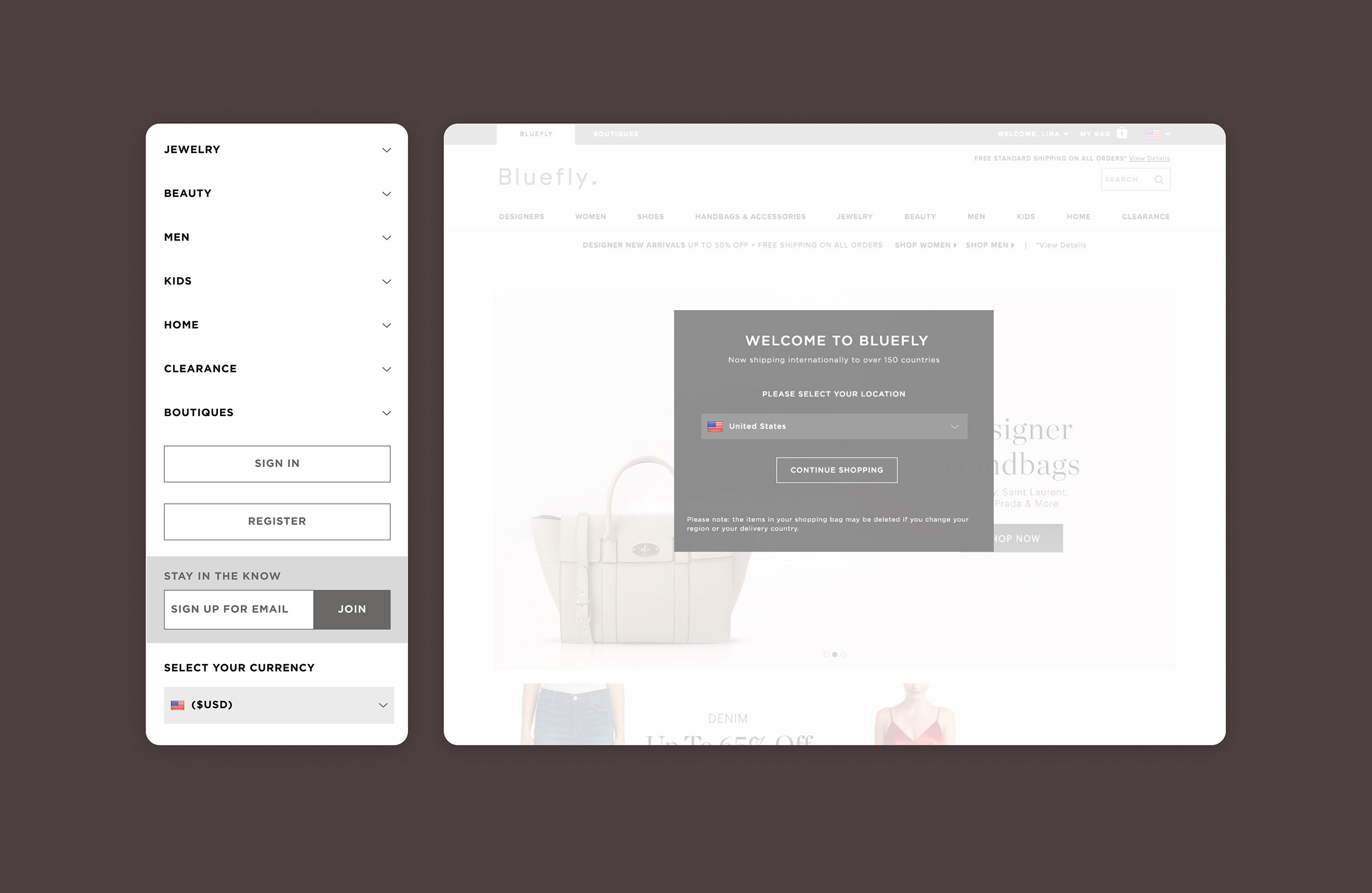
Bluefly had a large customer base outside the United States. To increase sales and reduce cart abandonment, we launched a currency converter that automatically adjusted pricing based on the user's location. This created a more pleasant and seamless shopping experience for our international customers.
Facets
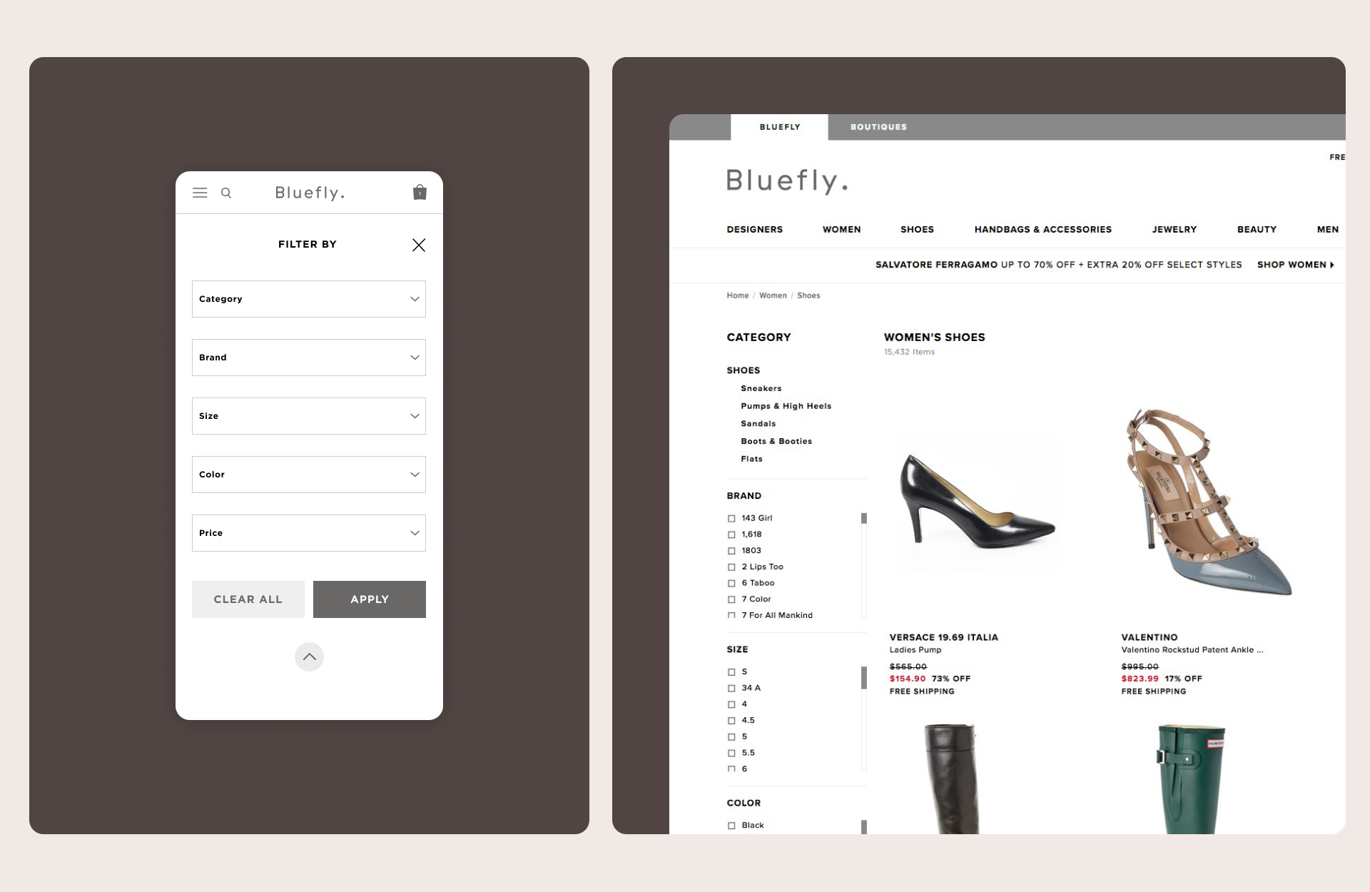
When shopping online with access to over 3,000 brands, filters become your best friend. At Bluefly, we constantly sought innovative ways to refine our facets and reduce friction, making it easier for users to find the products they were searching for.
We introduced new sorting features, including pricing, category, and brand search. I implemented the brand search as an input field, allowing users to type in the specific brand they wanted. This eliminated long scrolling through extensive catalogs and resulted in faster search times.
Ops & Tracking rebrand
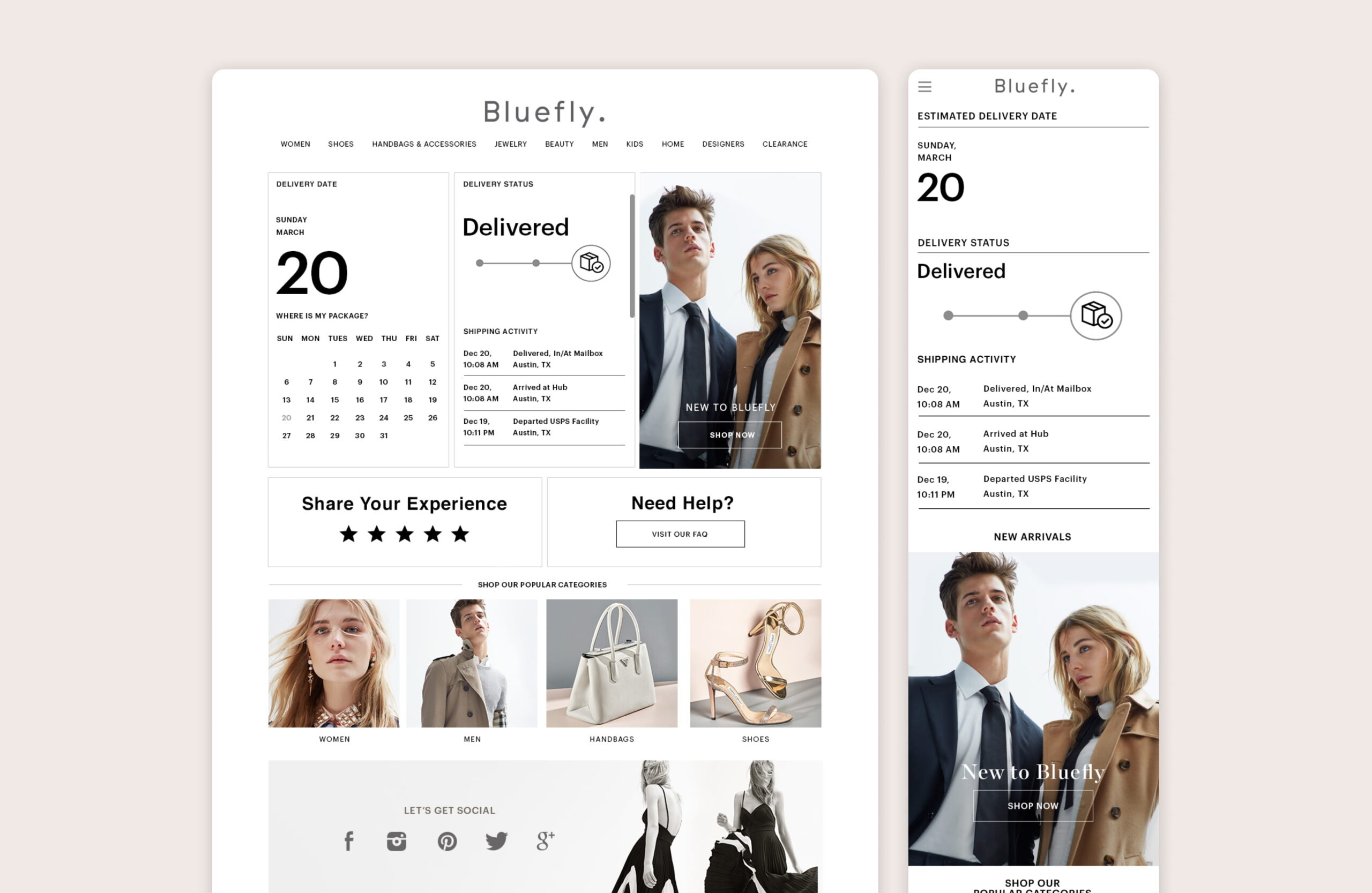
The operations and business intelligence teams needed to rebrand their automated purchase and shipment emails. We partnered with Narvar to allow customers to view their order status and track shipments. Narvar was highly supportive during the implementation of custom features, helping us gain valuable insights into customer shipment tracking. Emails were triggered at specific times and events to retain customers and influence their behavior.
Adding recommendations & cross sells
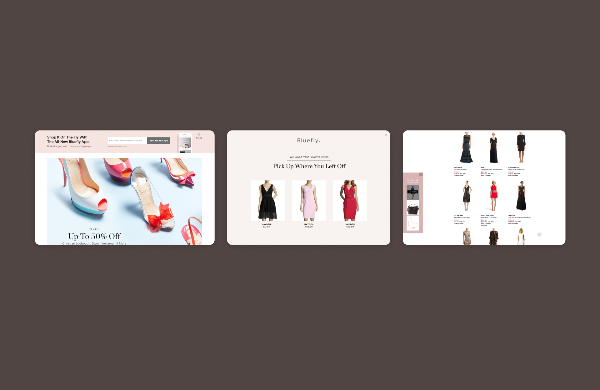
Based on a user’s browsing history and interests, we aimed to enhance the shopping experience by launching cross-sells and product recommendations. I collaborated with the marketing team and BounceX to launch this feature. We recognized that if a customer enjoyed a particular item, they would likely appreciate similar items or explore other department pages. To boost conversions and gather more data, we added this upsell feature to all product pages. The next step was to implement this feature in-house, enabling us to determine the best algorithm for recommending products to customers, ultimately helping us retarget them to return to Bluefly.
Cart & Express Payment options
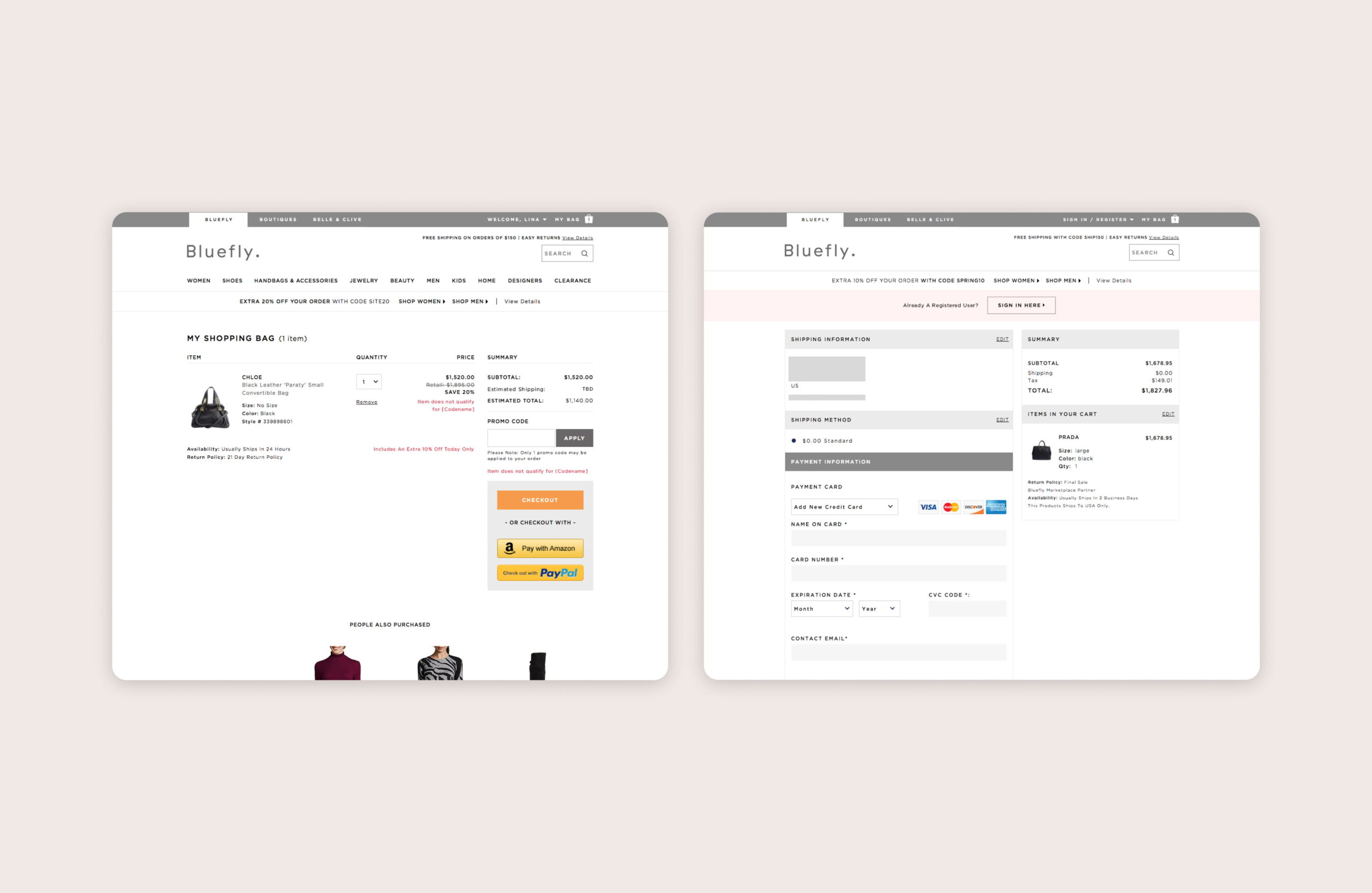
The cart is where most companies experience significant drop-offs. To build brand trust and boost sales, we introduced Amazon and PayPal express payment methods. This allowed users to log in directly from Bluefly during checkout and complete their purchases quickly. After launching these options, we saw a substantial increase in traffic and conversions.
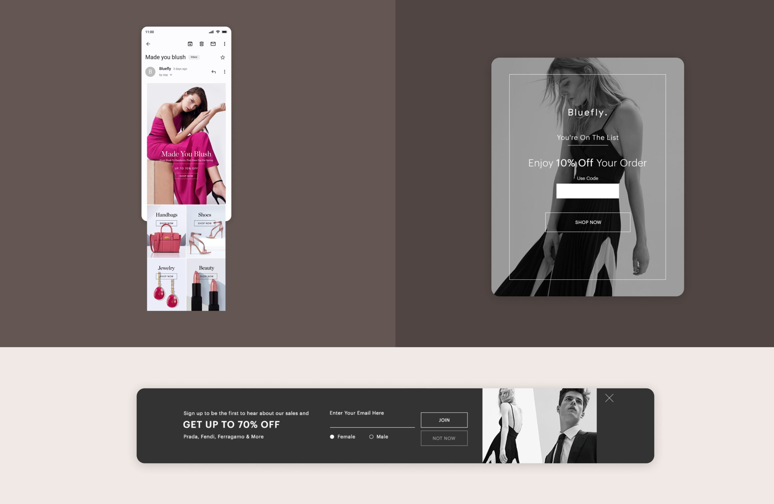
Email captures
Pop-ups are one of the many frustrations we all face while shopping online. We get it—just give us the discount already! It’s a clever tactic, and it works every time. No wonder email marketing is consistently ranked as the most effective marketing channel.
To retain our customers and gain new insights, I collaborated closely with the design and email marketing teams to rebrand all marketing initiatives. As a result, we increased overall web traffic, boosted revenue, and improved conversion rates.

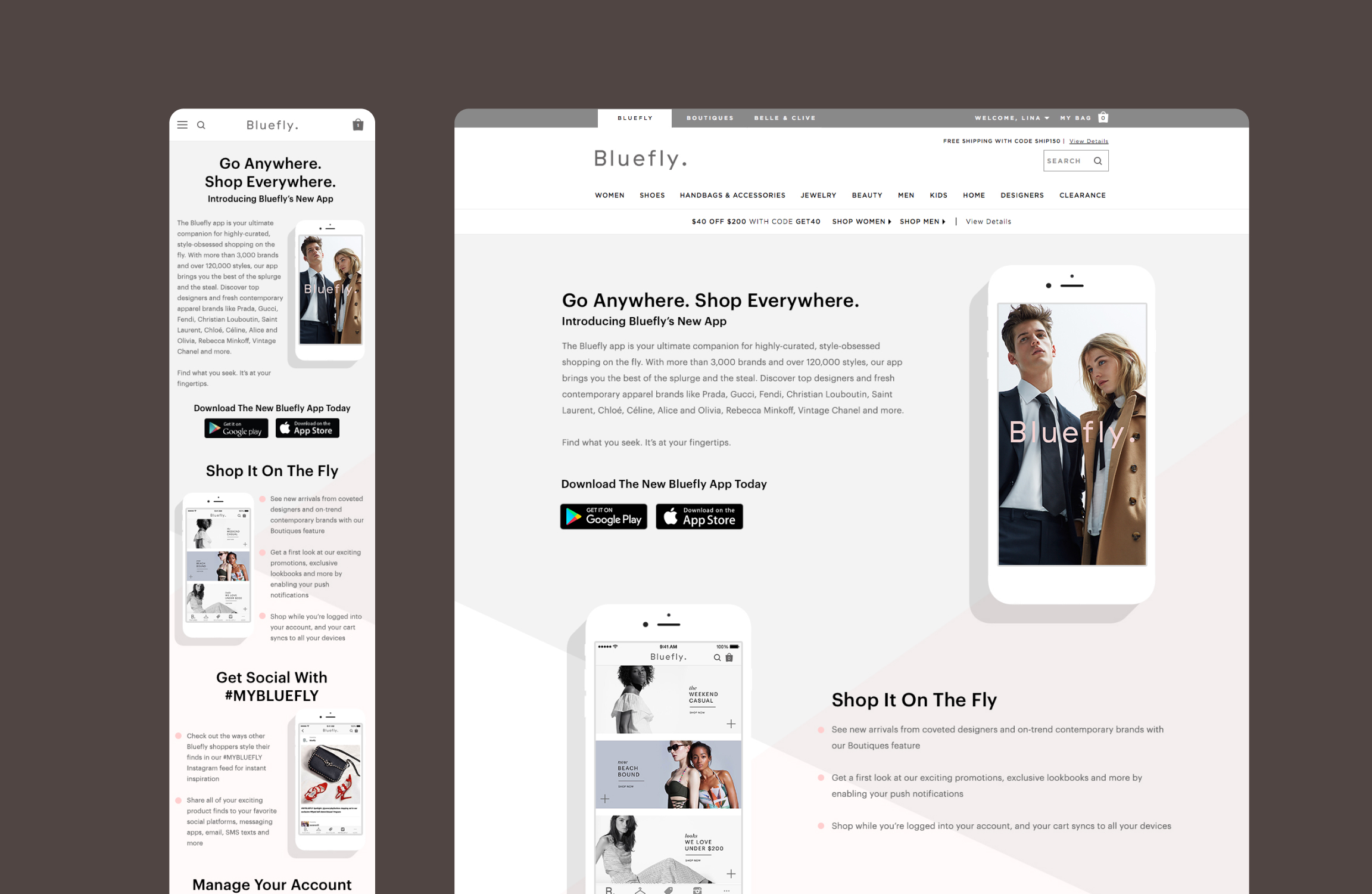
Bluefly app launch
Bluefly’s new shopping app launched in May 2016. As an extension of its new platform, Bluefly was excited to introduce a fresh shopping experience for both iOS and Android users. The app features included a personalized social shopping experience and notifications to announce daily sales.
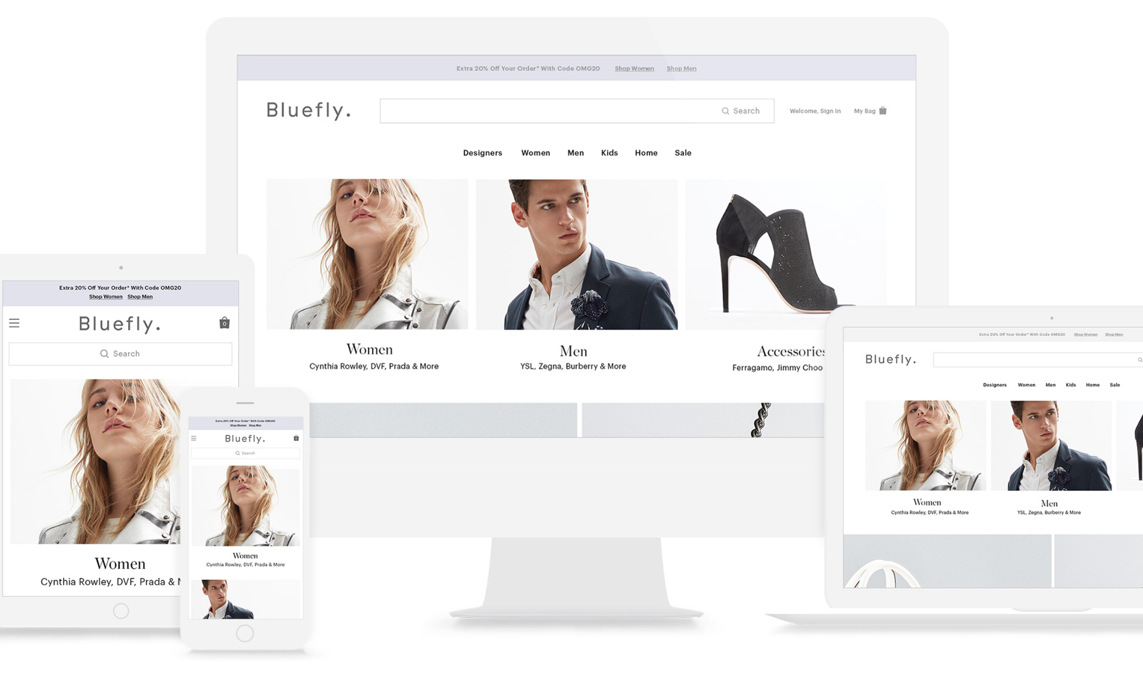
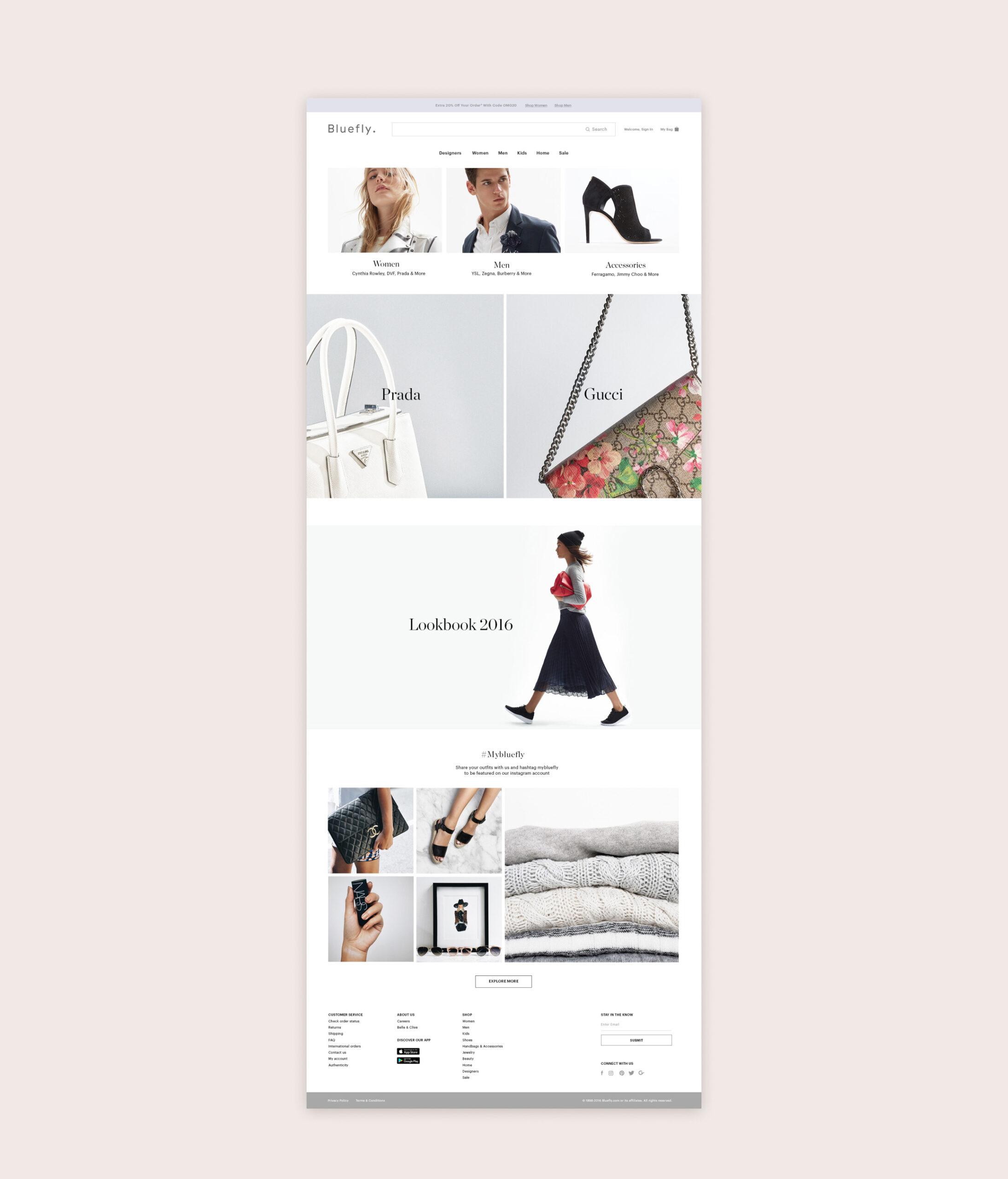
Future prototype
Gathering all my learnings, I designed a prototype to show what next steps can be for Bluefly. This holistic approach was to showcase how we can elevate our current design layout and proceed with testing capabilities.
Key takeaways
Blood. Sweat. Tears. I truly enjoyed my time working with every member of the Bluefly team. There was still much work to be done, and the crucial deadlines along with the ongoing operations of the business kept us busy throughout the entire process. Despite the challenges, we successfully made it to the finish line.

ZyroAI consumer and brand platform
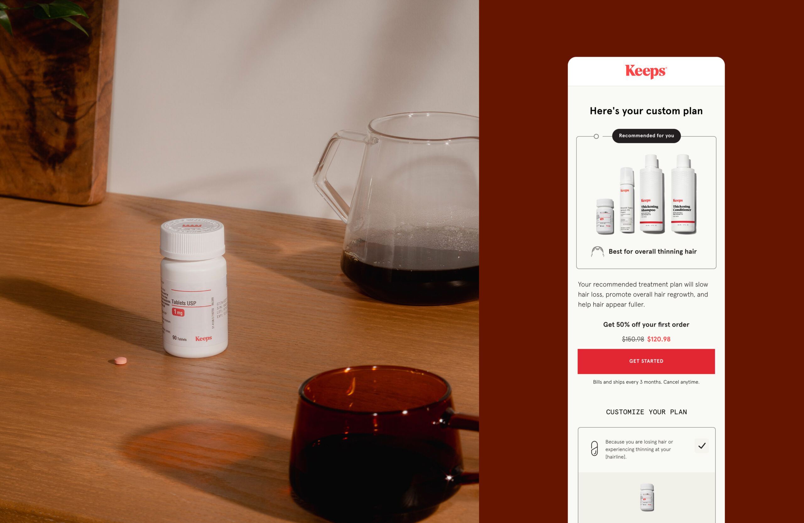
KeepsBrand refresh for a mens hair loss company
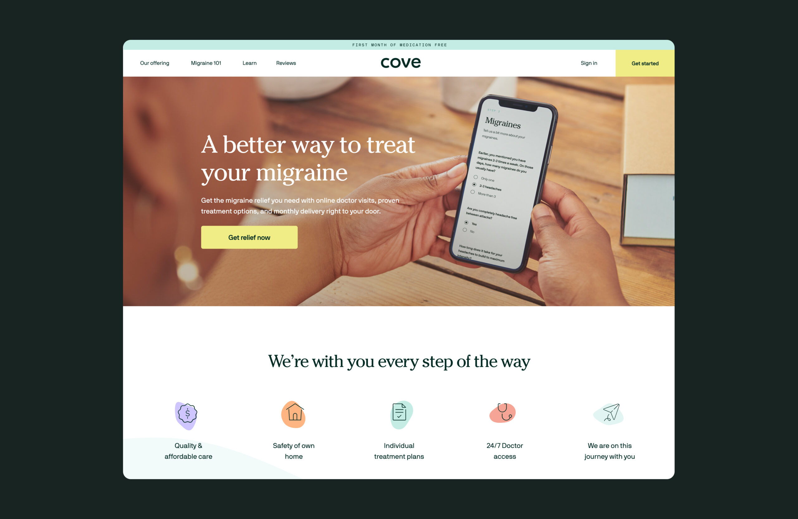
CoveRedesign for a migraine company

Nectar SleepProject type
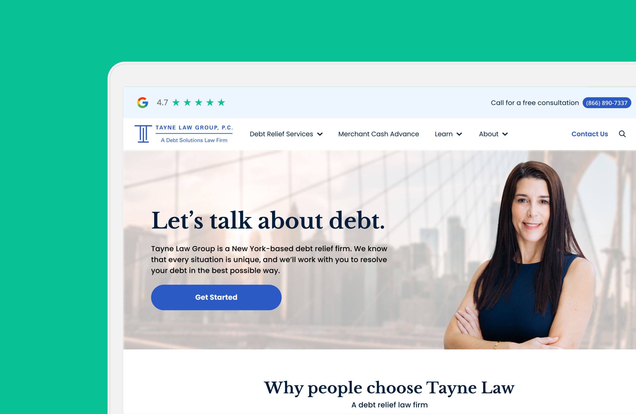
Tayne Law GroupRedesign for a law firm

SpeedoProject type

Via GelatoProject type

Joséphine CosmeticsProject type

Kenneth ColeProject type
© Lina Yang. All Rights Reserved.
