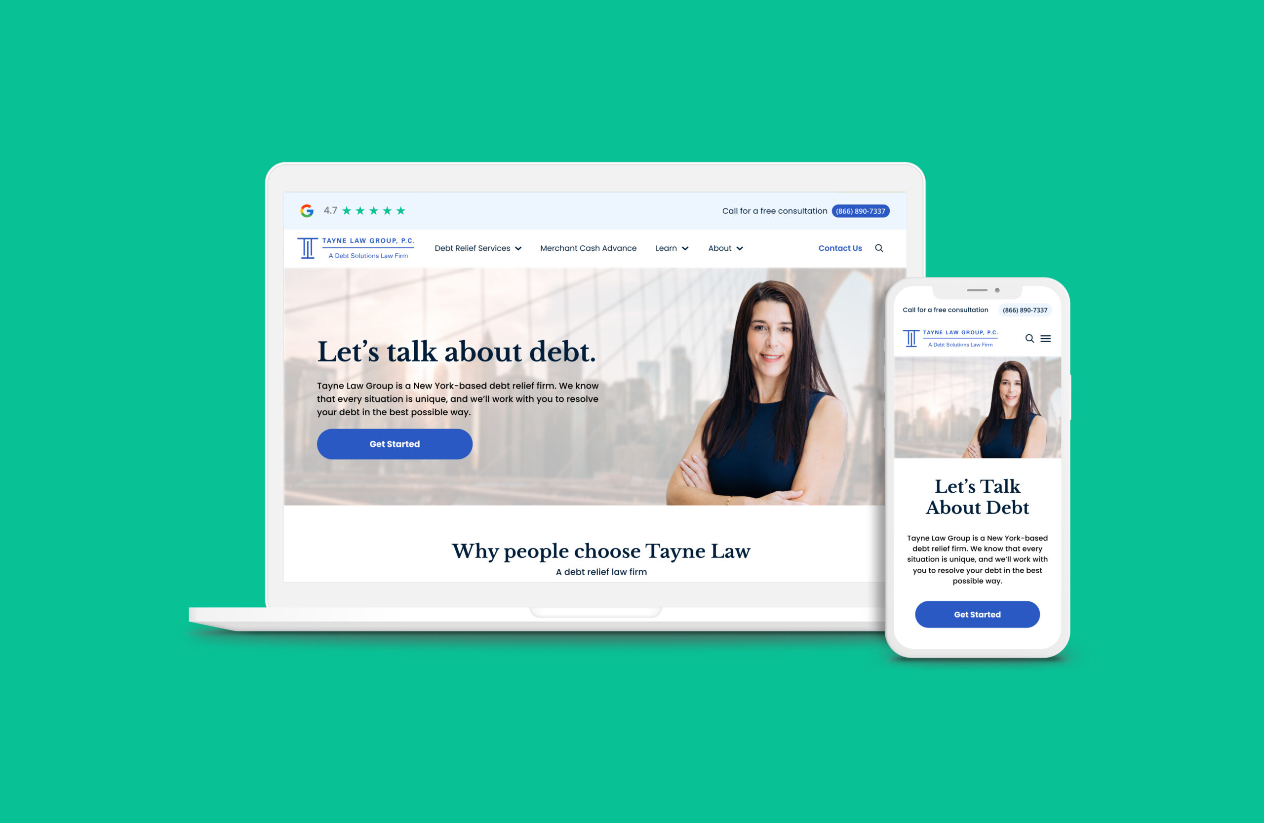
Tayne law group rebrand
Tayne provides a full range of services designed to help individuals and businesses manage, reduce, or eliminate their debt. The debt law firm rebrand required careful consideration to ensure that the new brand aligns with the firm's mission, values, and target market while effectively addressing any challenges or misconceptions associated with the current brand. Under Wimm, a product design agency, I worked closely with the founder to strategize and direct a full product team for Tayne’s new face lift. The redesign of Tayne’s logo was inclusive to stay on top of modern trends and add consistency with the renovated site strategy. Starting from scratch, our team managed everything from site architecture, SEO, site content and all service pages. These primary pages included the homepage, debt relief services, credit card debt relief and new services, business debt relief, student loan debt relief and personal loads debt relief pages just to name a few.
ROLE
Creative Direction, Lead Product Designer
YEAR
2021
CAMPAIGN

Listening to users and business needs
The legacy Tayne website was not up to par with their modern day competitors. The content was disengaging and all over the place. Also, no user testimonials were given to retain brand trust. When putting careful thought into the site architecture and designs, all the resources and information given to us were primarily addressing concerns on the website. Mostly due to overstimulation of content which lead to confusion when in dire need for help and personal research. Therefore, a lot of people called to ask questions rather than navigate on their own or find answers elsewhere.
Top priorities and goals
- Update content, add videos and user engagement properties across service pages
- Reintroduce Tayne as a brand people can trust
- Tell a story and show real-life testimonials
- Configure and integrate data
- Revamp site architecture and wayfinding
- Create a new voice and tone so that clients feel comfortable
- Build the optimal landscape to help educate clients and new prospects under the new renovation.


Rebranding Tayne’s logo
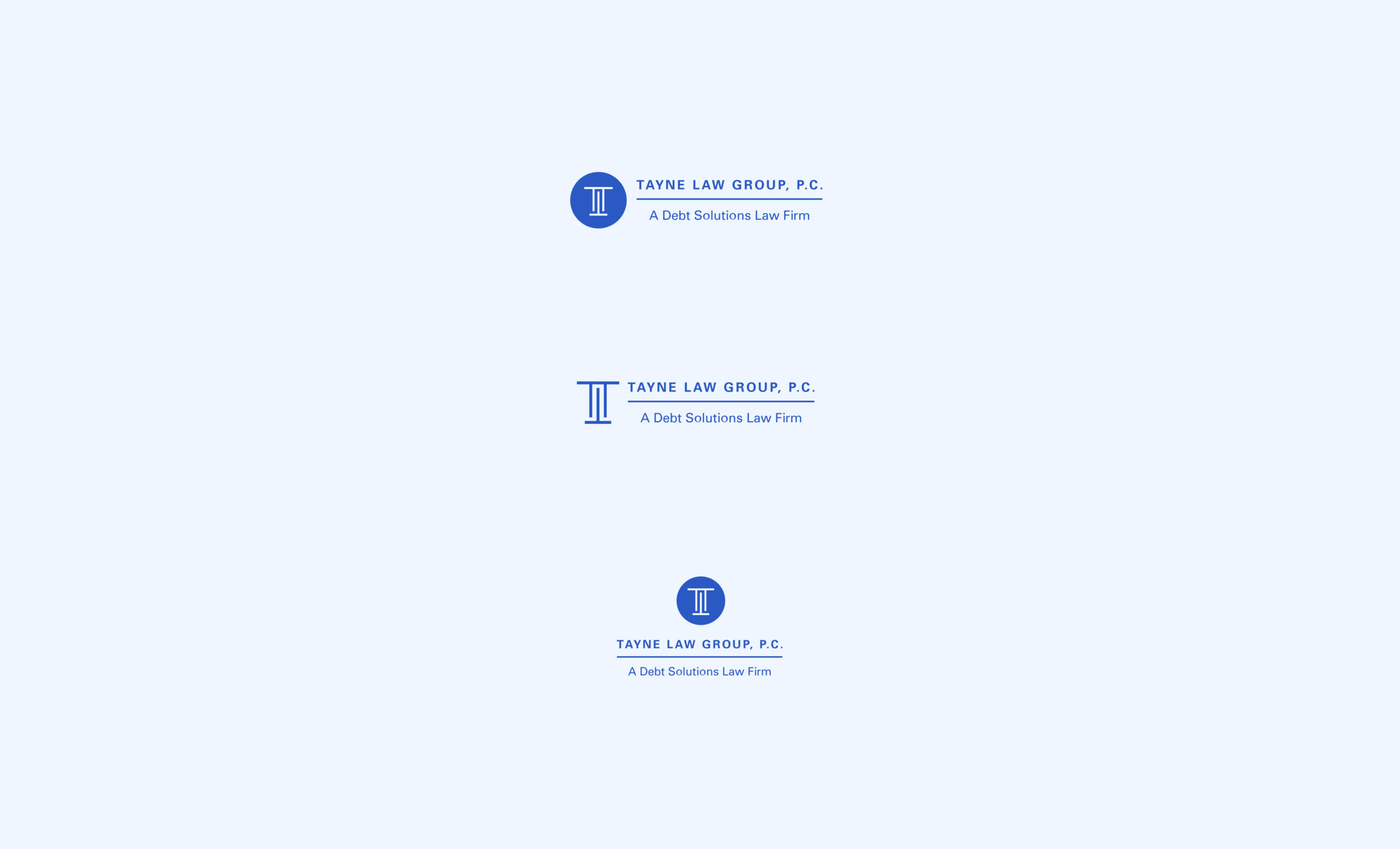
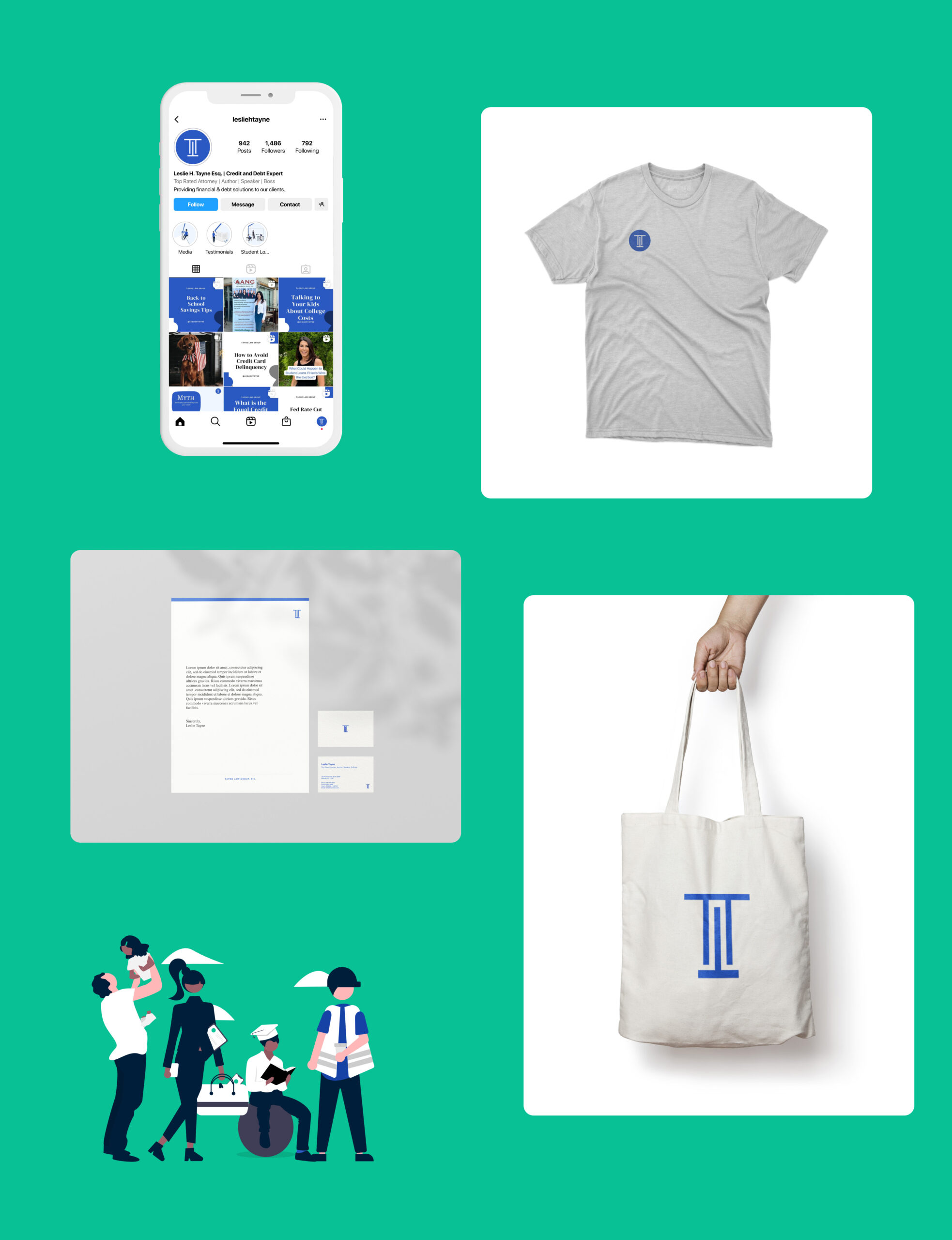
I was asked to redesign Tayne’s logo. The goal was to ensure that the new brand reflects the firm’s mission and long-term vision. Their position in the market needed to resonate with their target audience. As you can see, their old logo contained graphics that were not on brand and looked like a worldwide communications firm rather than a law firm. I took the direct approach to simplify the logomark and create a straightforward tagline that encapsulates the firm's new brand identity. Also in tandem, worked with their marketing team to come up with a plan to promote the rebranded firm, including digital marketing and social media.
The problem:
- Outdated graphics
- Color of logo needed to be updated to new site experience
- The logo doesn't tell any stories, making it hard to expand and create new brand elements across the site
- Did not stand out as a law firm against competitors
What changed:
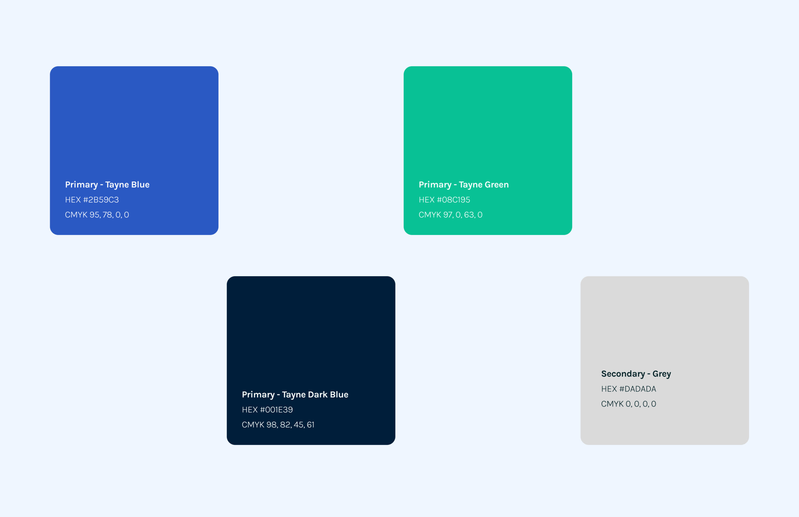
- Updated the firm's visual identity, including color schemes, typography, and design elements, to align with the new brand, website and company merch
- Variations of logo guidelines and usage
Revamping the voice and tone
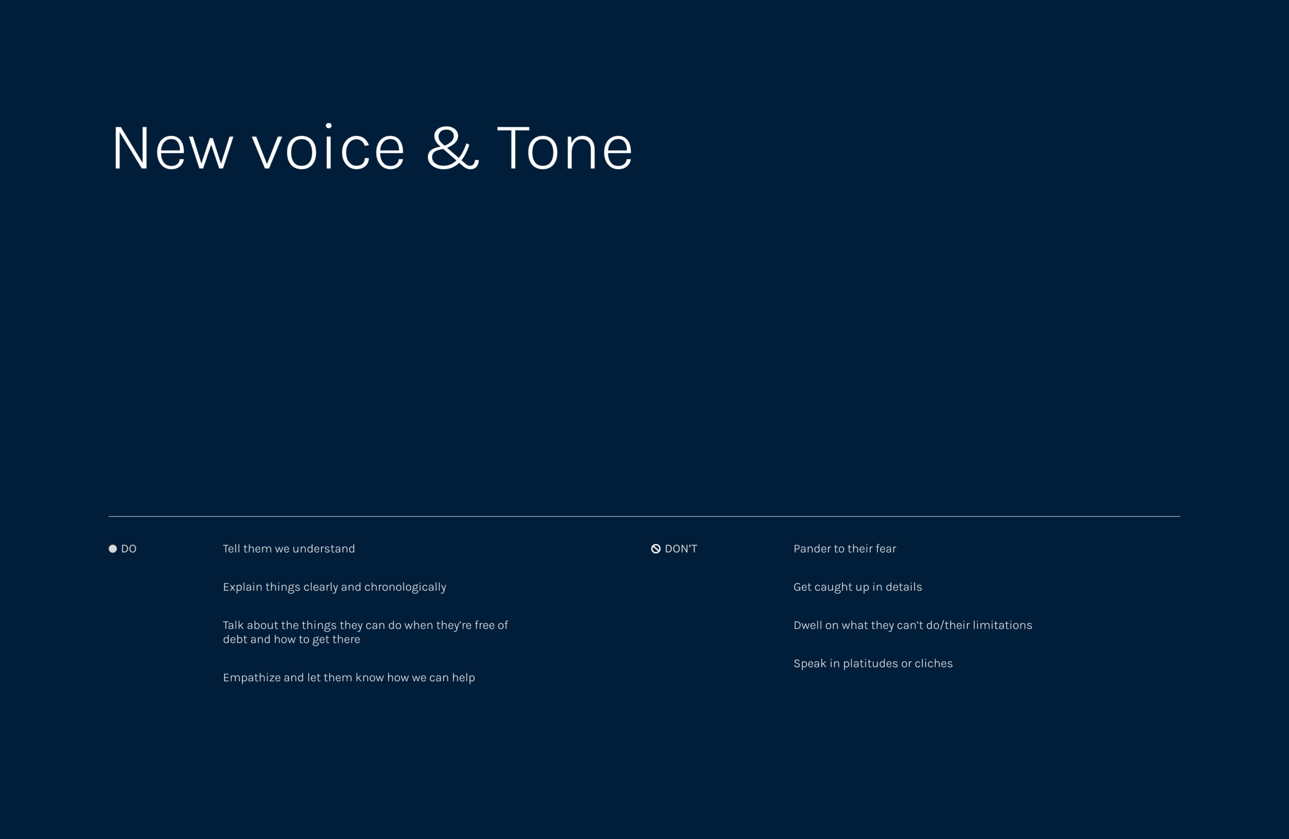
Tayne’s legacy language was too complex, long and less impactful to customers calling in about their debt. Working with our copywriter, a voice guide was essential for the business to make sure all teams stay on brand for consistency, measure engagement and explain things more clearly. The updated copy on the site allows reassurance to help clients understand what they are reading across the website.
Site strategy
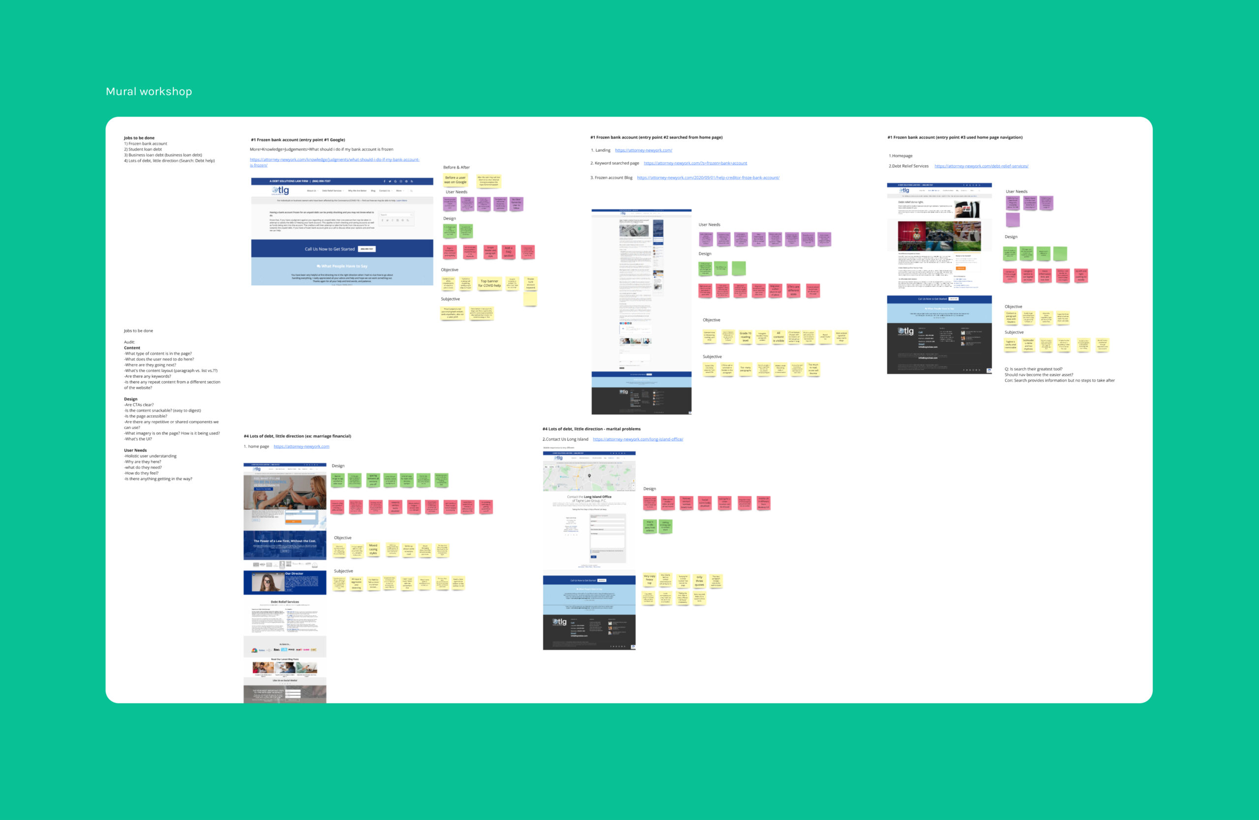
Creating clear guidelines to lead the strategy for product, design, engineering, and marketing was discussed in meetings to discuss lost information and mitigate any blockers across all work streams. Everyone stayed in their lanes and was able to achieve their individual contributions. Our workshops were utilized to coordinate project timelines and jobs to be done. Being able to discuss these matters upfront and providing clear direction to maintain the workload made productivity more enjoyable, effortless and productive. The example above shows the team using mural during a workshop.
Site mapping and storytelling
In order to figure out user needs, we had to make a lot of assumptions based on the lawyer’s experience, customer calls and reviews. There was no data to work with, but the law group had many years under their belt to pick up patterns and find what was needed. Our team went ahead to formulate best practices providing Tayne Law Group a foundation to build on in the future once the website became measurable and more accessible to new clients.
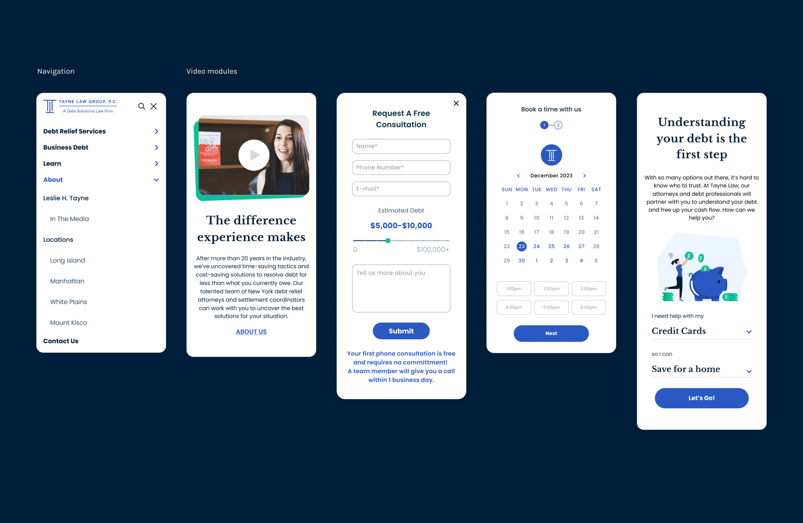
The redesign
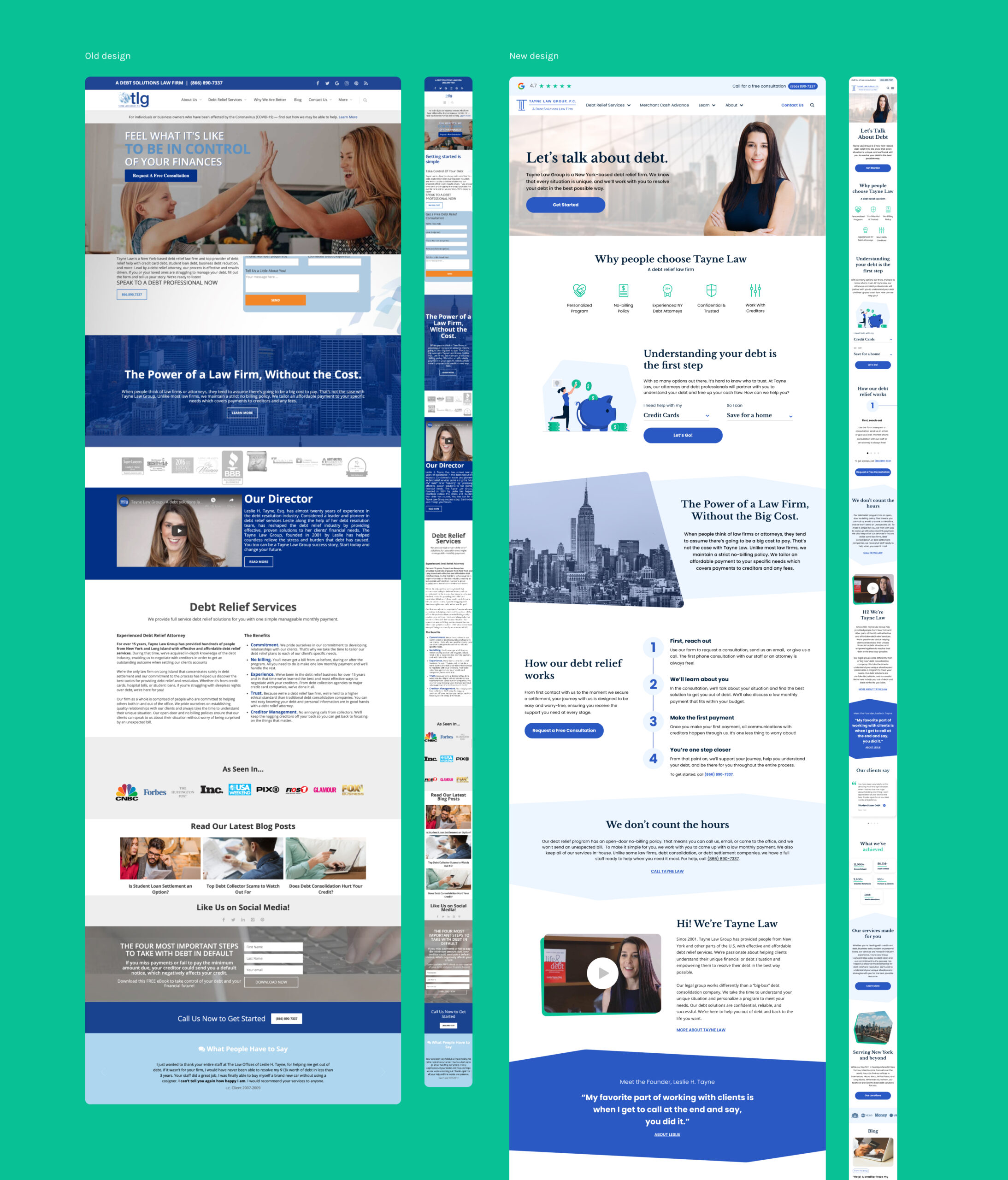
After auditing the entire site, tons of research, lots of meetings and workshops, the final approach geared towards professionalism, clarity, and trustworthiness, while also ensuring ease of use and accessibility for potential clients. All of Tayne’s content was revamped which included a new design system, navigation, consistent imagery, videos, and contact forms just to name a few. Now in place with modernity, it tells a consistent story and represents an entire suite of debt solutions to educate and allow a more delightful experience.
What was updated
- Imagery across all pages with professional headshots of the attorneys
- Voice & tone guidelines and content
- Modular components for future iterations and testing
- Design system
- Client testimonials module to build trust
- Added featured services to highlight the main practice areas with links to detailed pages
- SEO optimization to improve search engine ranking
- Tayne’s accolades of industry awards, recognitions, certifications, and affiliations
- Clear display of office locations with google integrated maps
- Contact form fields tailored to capture relevant client information across multiple pages
- Optimize faster load times to ensure compatible mobile devices
- Prominent call-to-actions with next steps
- A clear, mobile-friendly navigation structured to highlight key sections and subcategories
© Lina Yang. All Rights Reserved.