
Nectarsleep
Nectar is the first-ever bed-in-a-box company to offer a 365-day home trial in the industry. As part of Resident Home, the Nectar mattress supports all types of sleepers with optimal levels of firmness, coolness, and comfort. I was the lead designer on the product team responsible for launching the new design system, homepage, cart, and product details pages to enhance user engagement and increase conversion rates.
ROLE
Lead Product Designer
YEAR
2018-2019
CAMPAIGN
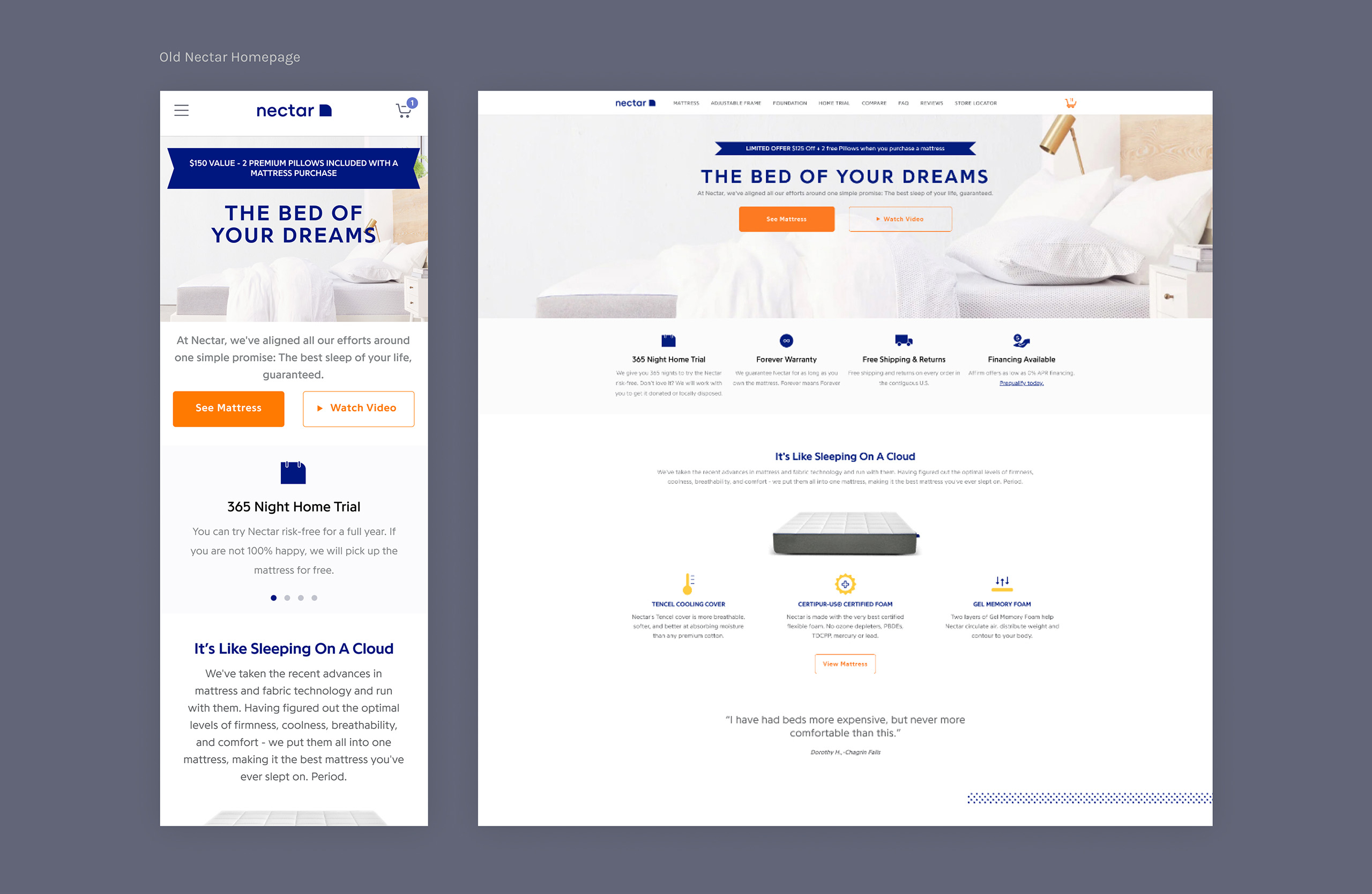
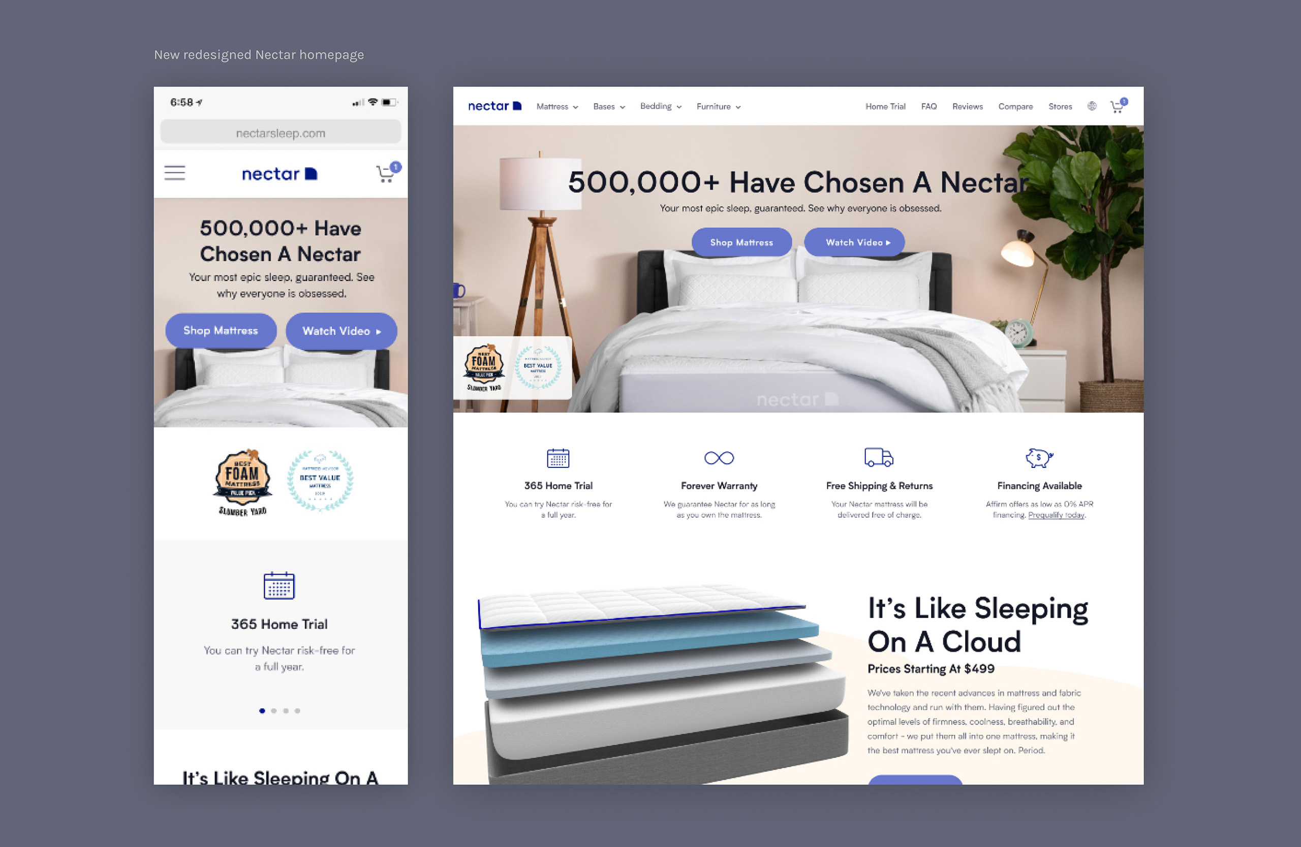
Homepage redesign
We all know that the homepage serves as the main hub where shoppers return to explore what a brand has to offer. It needs to capture the user's attention in an instant, but if poorly designed, users may quickly leave and navigate to a competitor's site. To engage customers in making their decision on a Nectar mattress, we conducted user testing to understand what they wanted to see on our homepage.
Key findings from the user testing included:
- A link to icons below the hero section to access more detailed information
- Featuring other well-known brands and reviews to build trust in Nectar
- Highlighting the 365-Night Home Trial with a link to more details
- A comparison chart with top competitors like Casper and Purple
- Cross-sell opportunities, showcasing other products available at Nectar
Understanding user needs & goals
As a savvy shopper myself, and knowing how easy it is to make impulse purchases, I understand how overwhelming the online experience can be. Ads, videos, articles, more ads on top of ads, and brands you’ve never even heard of—it’s chaotic. During my time at Resident, I encountered significant issues with the overall site experience. It felt like navigating a maze. Where do you even begin? The site was overwhelming, and my thumb was tired from constantly clicking or tapping to close every pop-up. Much of the content across the site felt redundant, and I definitely didn’t feel like reading through every section.
When I shop for something, I usually do my due diligence by comparing prices, brands, and reviews. It was clear we needed to figure out what our customers were saying about us.
Conducting user research & gaining Insights
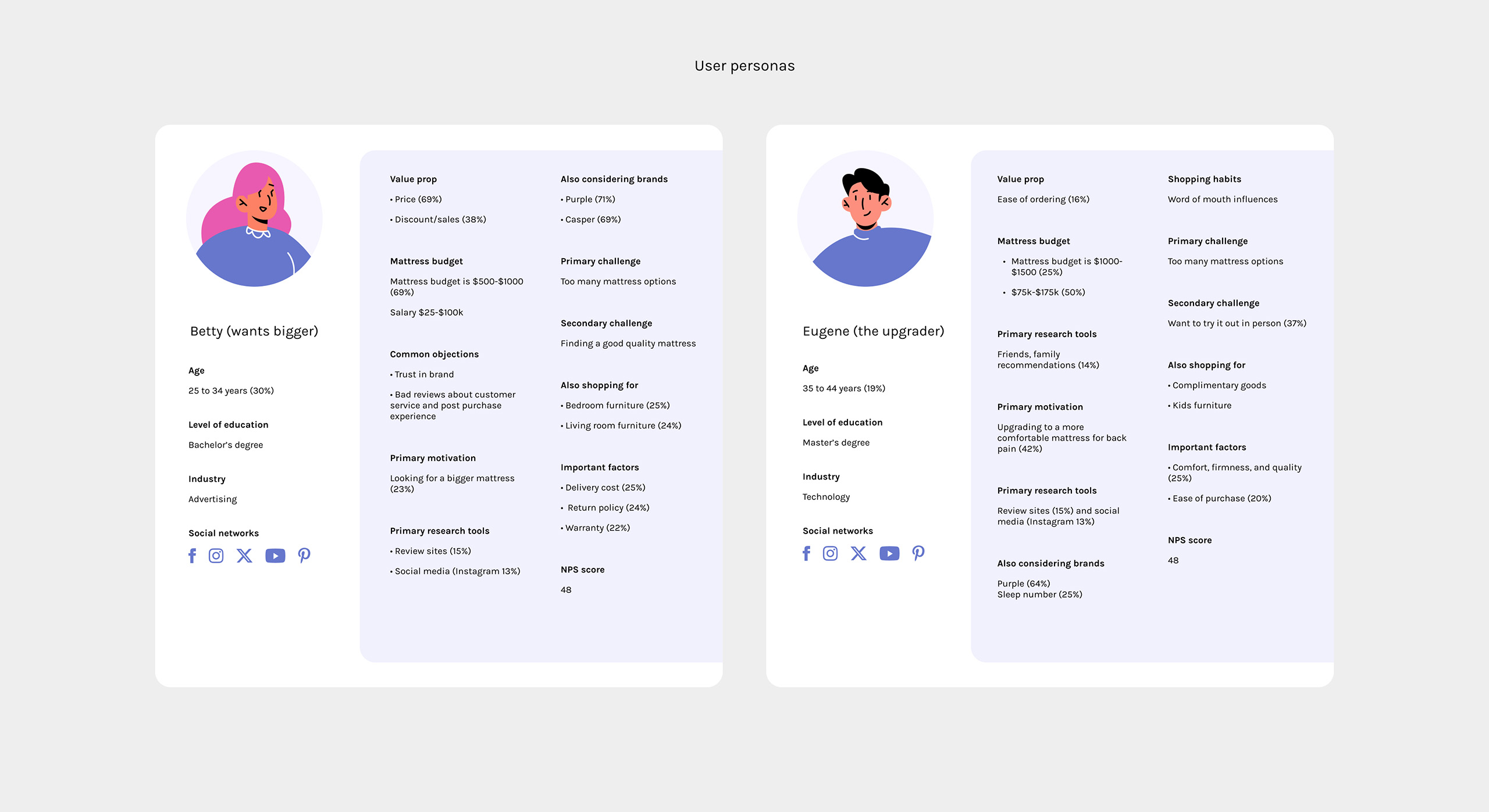
I had the opportunity to work with a senior UX researcher, who helped me identify problem areas and validate user pain points. UX research is critical, especially when the design isn’t communicating effectively or when marketing heavily influences design decisions. Quantitative research and surveys became key tools in guiding my design decisions, helping me focus on the most pressing problems that needed to be solved.
Users
- Ages 25-40
- Income $40-$100k
- Within the United States
* Based on 1800 survey participants
Objective
- To learn what is working and improve our current experience to increase upsells and conversion
- Ask users to give feedback on site content including copy, images, and their overall experience
Facebook and Google insights
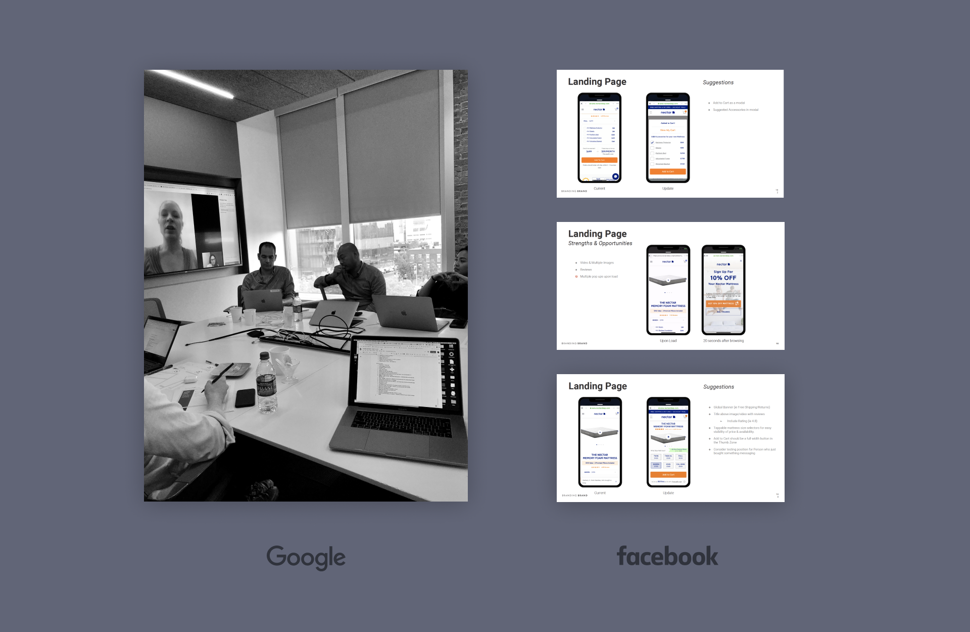
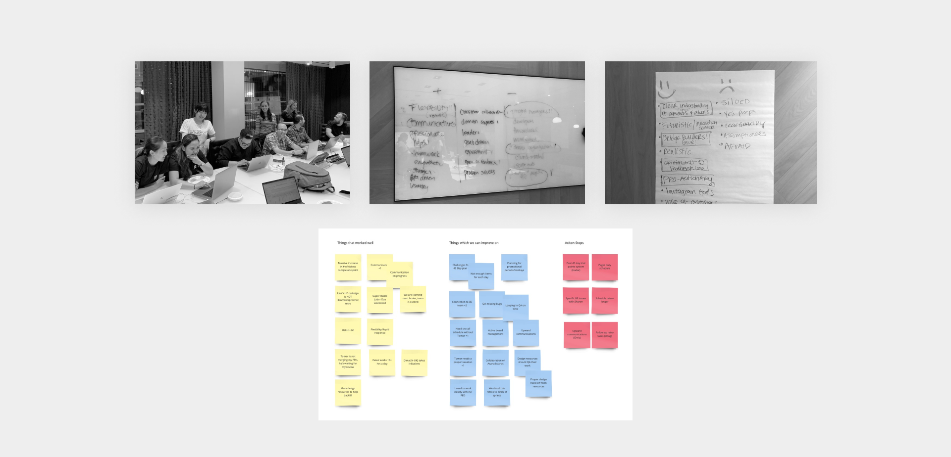
Our team had the incredible opportunity to work with Google and Facebook. As key players in the industry, they provided valuable user insights that helped us improve crucial aspects of achieving business goals and creating a more sustainable customer journey. We also spent a day onsite at Google conducting live user interviews, which proved to be highly insightful. I gained valuable perspective on how factors like age, location, and profession influenced users' purchasing decisions.
Design process
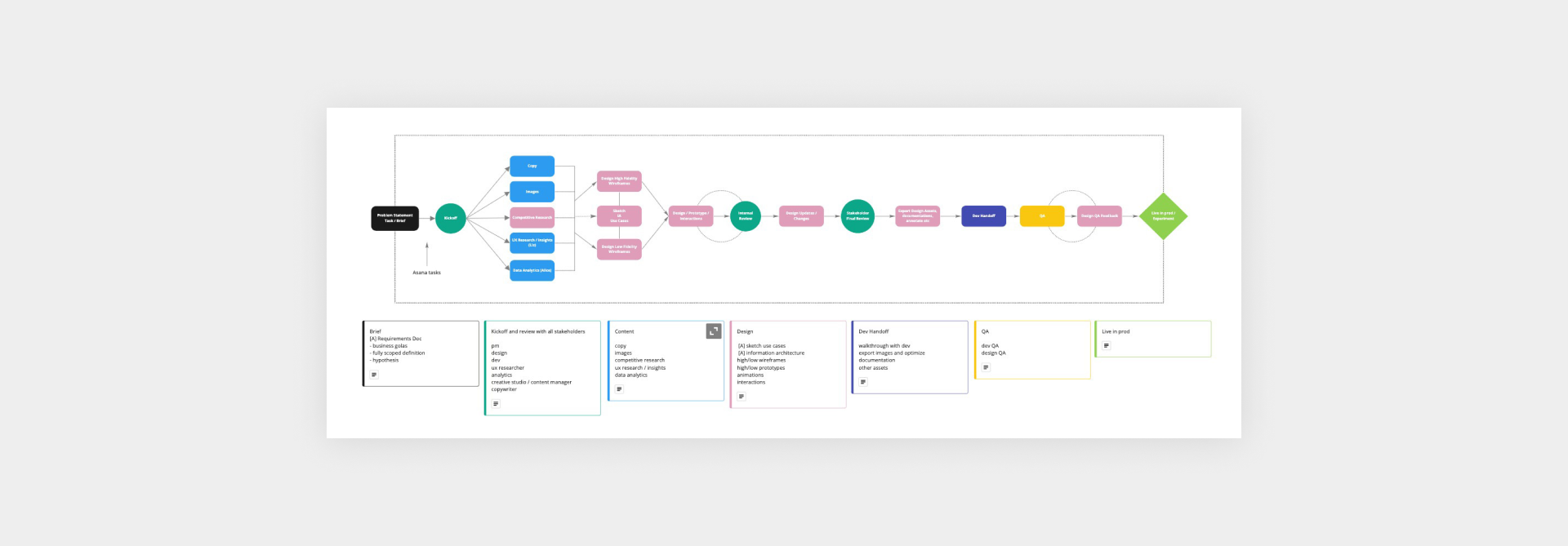
At Nectar, part of my time was spent troubleshooting processes to align with our remote culture. Simple tasks like receiving briefs, setting deadlines, gathering missing assets, and collaborating with the development team were challenging. Why? Because there was a lack of transparency and knowledge sharing. One of my key initiatives was to teach design goals and establish what was and wasn’t working for us across the board. Creating individual roadmaps helped clarify how to address recurring issues. It set realistic goals and fostered empathy, allowing us to collaborate and grow more efficiently as a team.
Lo-fi wireframes
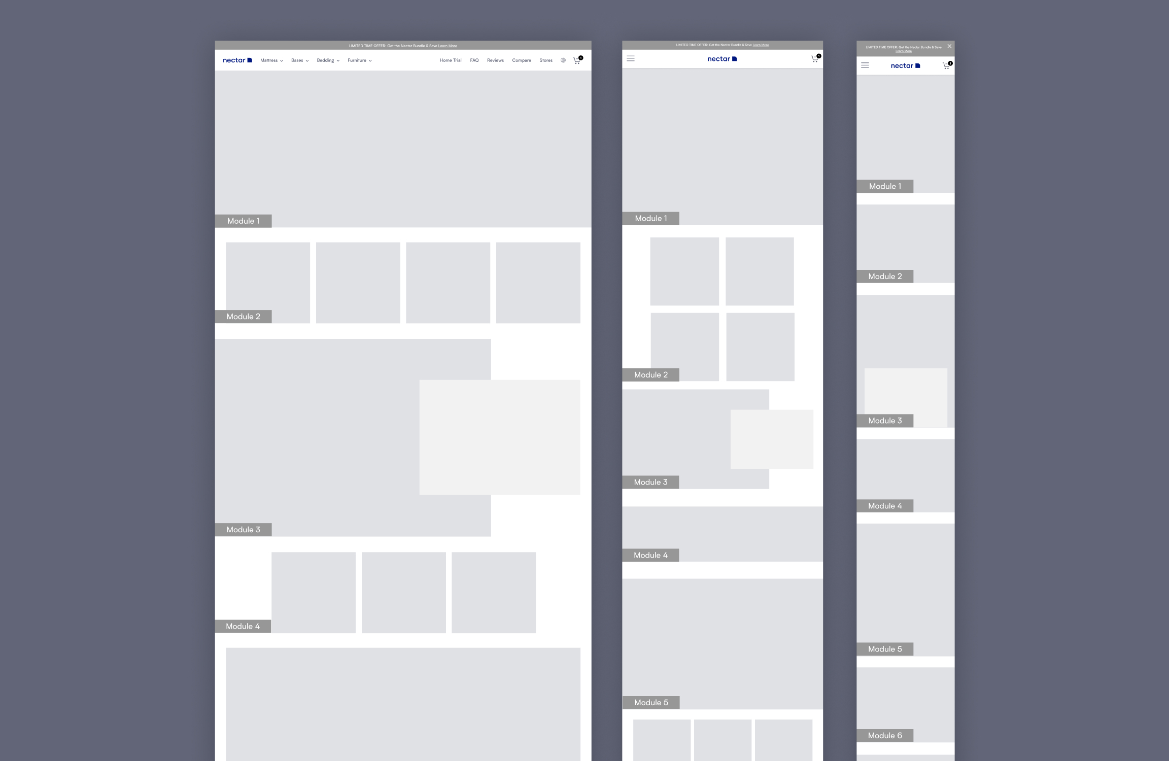
Some low-fidelity wireframes helped visualize where the new templates would be placed. My goal in creating these building blocks was to establish a foundation for conducting A/B tests, experimenting with different icons, copy, or imagery. These modules could be rearranged, removed, or duplicated as needed. Since the development team shared components across all our brands, it made sense to create as many templates as possible to add to our library for future use.
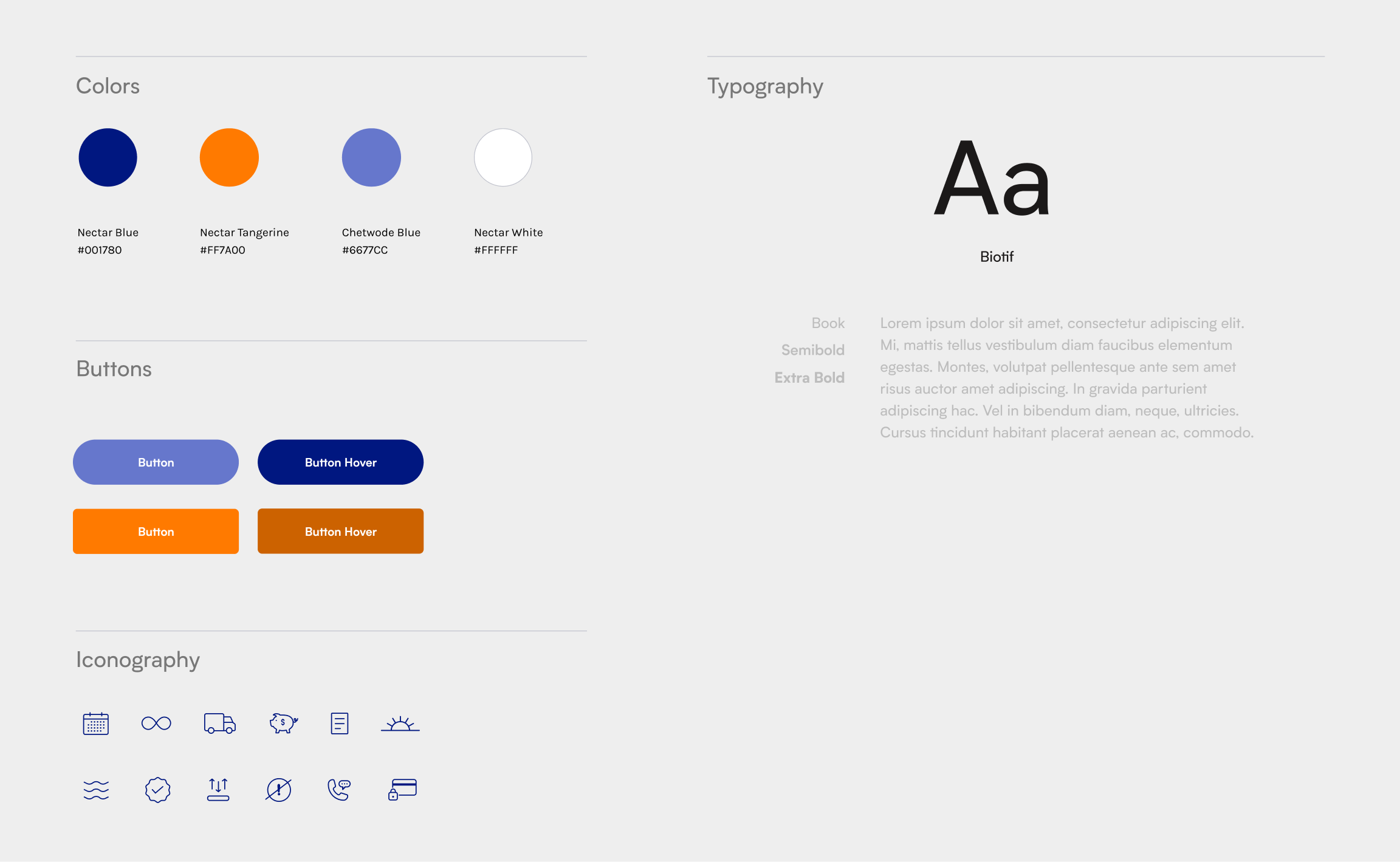

Mattress module redesign
There was a lot of back and forth about what needed to be removed, added, and tested on this page, resulting in too many cooks in the kitchen. Everything from layers, upsells, financing, and reviews was deemed equally important. This created a headache at first because everyone wanted their content to be placed above the fold. That simply wasn’t possible. Most importantly, there was no visual hierarchy, and the previous version of the page lacked storytelling.
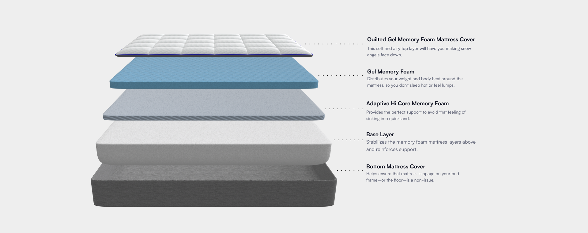
Given these challenges and insights from quantitative research, we identified the top three things customers wanted to see first: reviews, mattress layers, and comfort/firmness. After making these decisions, we tested product imagery against lifestyle imagery. Customers connected more with lifestyle content and videos.
Adding new layers & animations
To make the site more interactive, we wanted to introduce animations that would bring the mattress to life. During user research, interviewees noted that our top competitors had more enticing pages that built brand trust, and their mattresses appeared more comfortable.
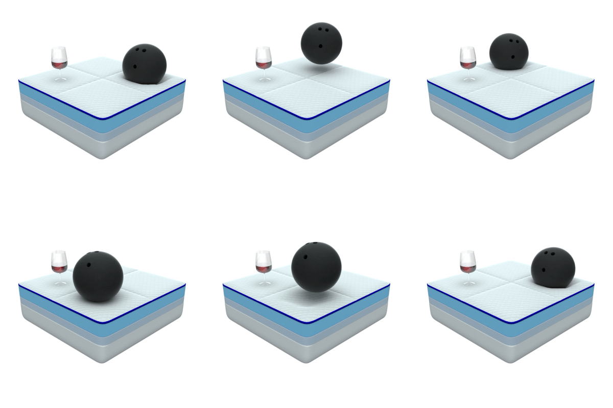
To give extra depth to our mattress layers, customers requested animations, similar to those used by our major competitors, so they could get a better sense of the physical feel online and understand how our layers were different from others on the market.
The two most-asked questions were about airflow and motion transfer. By adding looping GIF cards addressing these concerns, we significantly improved user conversion rates, helping customers choose the Nectar mattress over leading competitors.
The problem
During my time at Resident, one of the biggest challenges I faced was optimizing the checkout process. Our data revealed the highest drop-off rates occurred between the shipping and billing stages, and again between the review and transaction stages. We wanted to understand why this was happening.
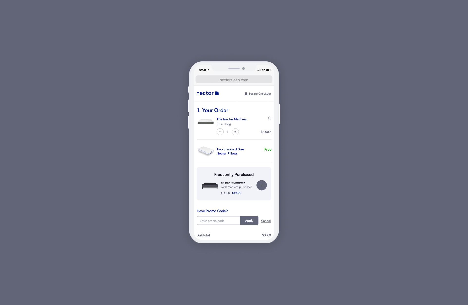
After analyzing the patterns, we aimed for quick wins by modifying the checkout experience. However, as a shared component across all Resident brands, there were limitations to what could be changed. Additionally, the lack of a cart feature restricted users from adjusting their purchases, which further impacted the checkout process.
Hypothesis
Adding reassurances throughout the checkout flow can improve each stage of the funnel, particularly from Shipping to Billing and from Review to Transaction.
UX Goals
• Checkout journey - start to completion
• Shipping & Delivery
• Delivery to Billing
• Billing to Review
• Review to Completed Transaction
• Checkout Upsell Rate: Foundation, White Glove Service, Quantity
• Editing information capability

Out with the old
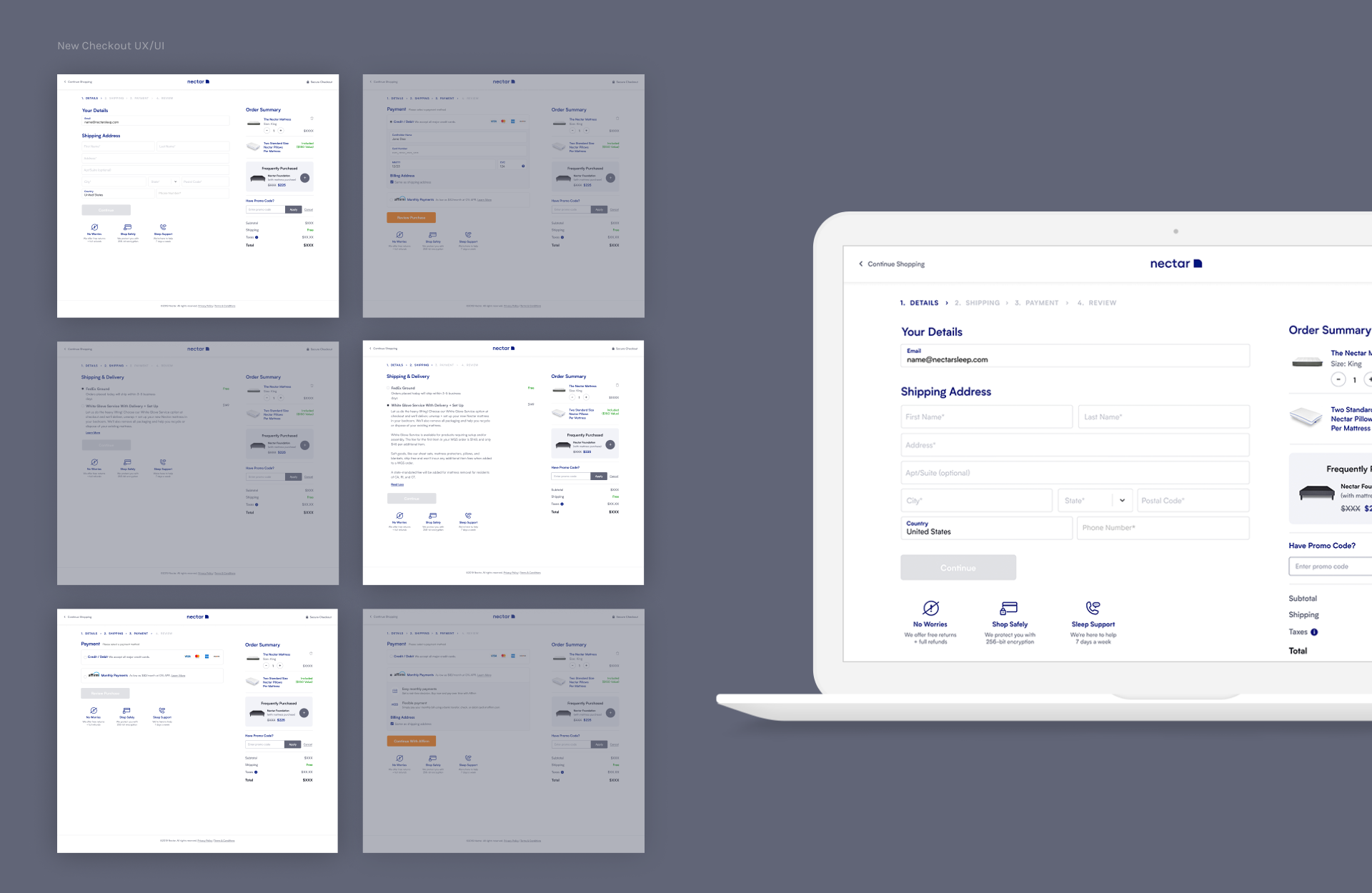
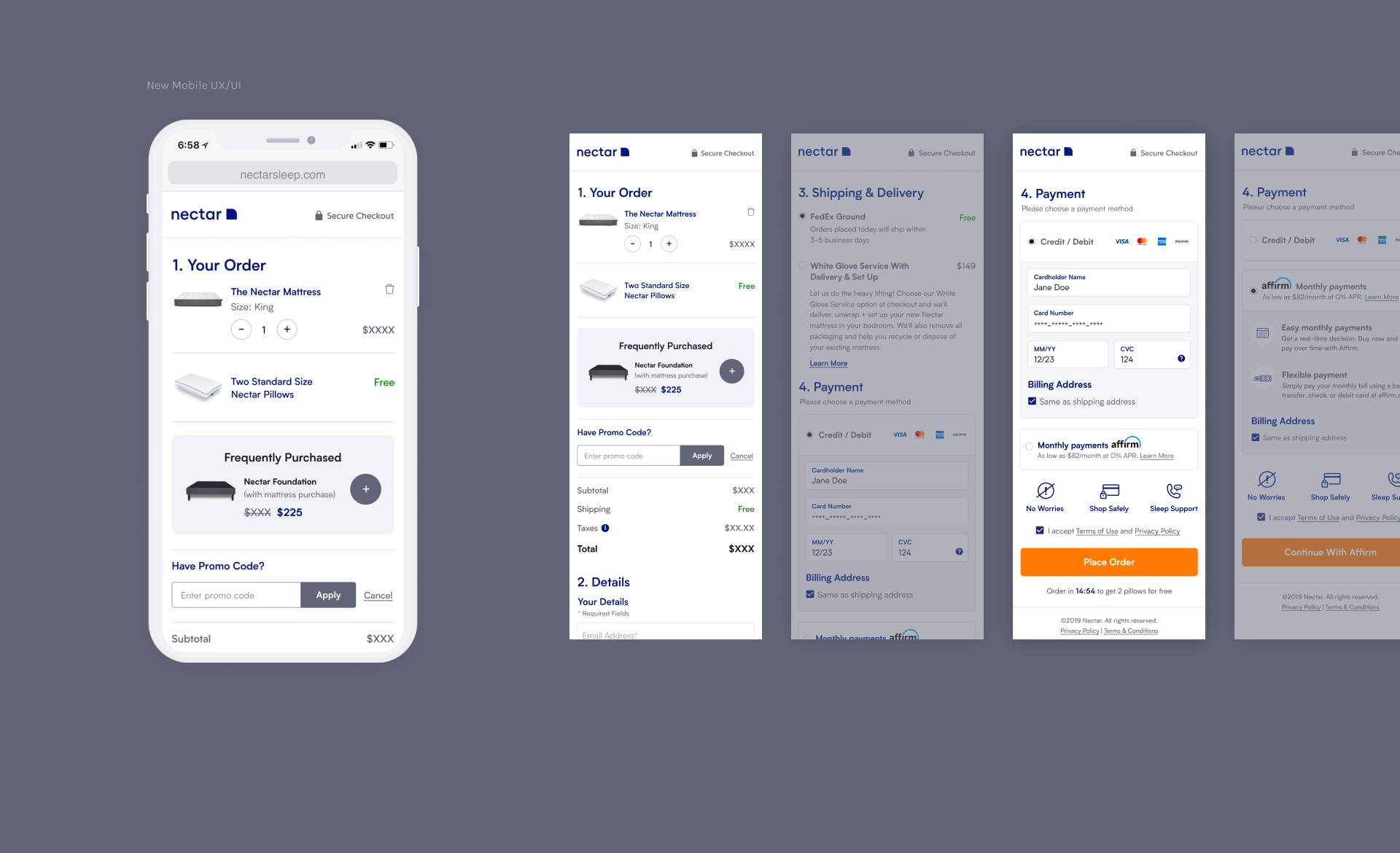
While quickly scanning through Nectar’s website, we immediately identified areas that needed updates to achieve the outcomes we wanted to test. The older designs were cluttered and felt out of alignment with current standards. We intentionally added more negative space to the interface for a cleaner look. The business was initially hesitant about placing the purchase button below the fold, so we decided to add a floating, sticky call-to-action as a constant reminder for users to check out.
Value props
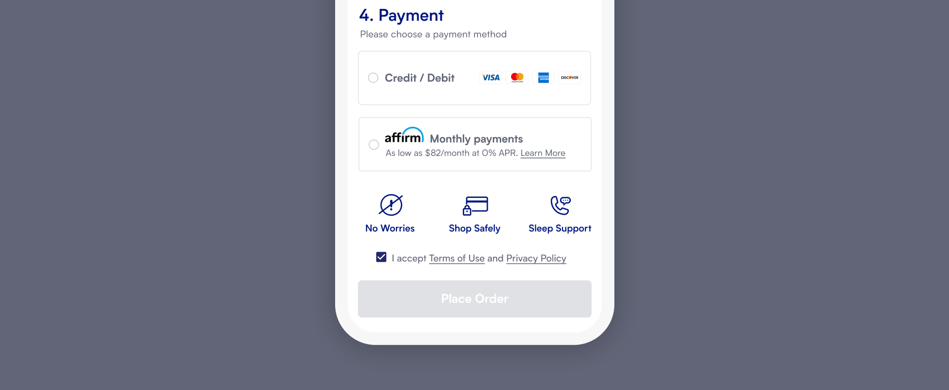
Customer service and brand trust are crucial when making a significant purchase, like a mattress. As a customer, having reassurance before clicking the "place order" button eases my anxiety. Our users experienced this as well, and more purchases were completed when they saw the trust signals compared to when they didn't.
Shipping & Delivery
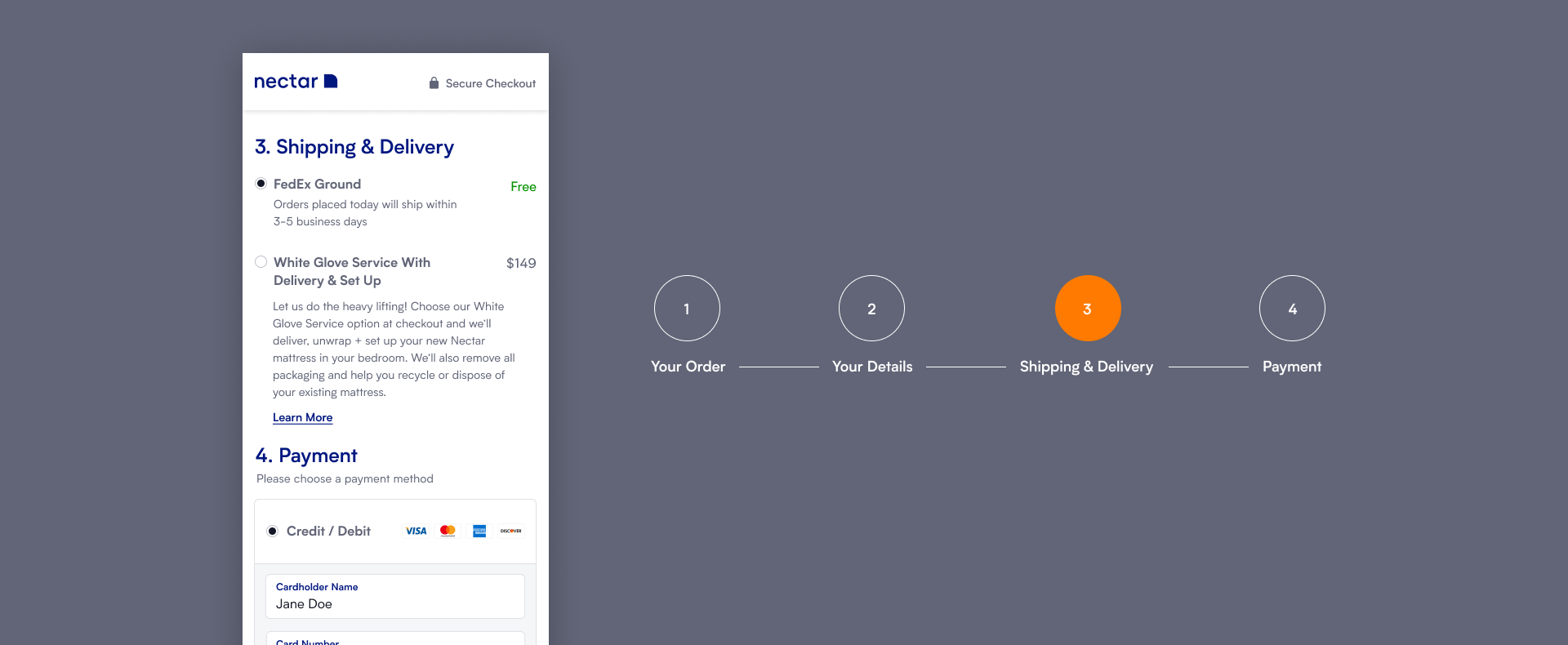
The first thing I noticed was the shipping provider and how long it would take to receive my mattress. This is critical when it comes to online shopping. By adding an extra step to the previous funnel, we saw a significant increase in conversions and sales. The original experience bundled White Glove Service as an upsell, but the shipping methods were unclear. Many customers complained that their orders arrived late or that they missed important messaging during the shopping process. To address these issues, and with the help of our customer service team, we added a step to highlight that we offer free shipping and White Glove Service for an additional fee.
Results & key takeaways
After weeks of testing, we observed a statistically significant improvement in the new experience and features. Despite tight deadlines, our team successfully boosted conversions and daily sales. These small changes had a significant impact, opening the door to many other testing opportunities that will challenge us further. To maintain this momentum, our next steps include adding mobile steps and express payment options to enhance the payment process.
© Lina Yang. All Rights Reserved.