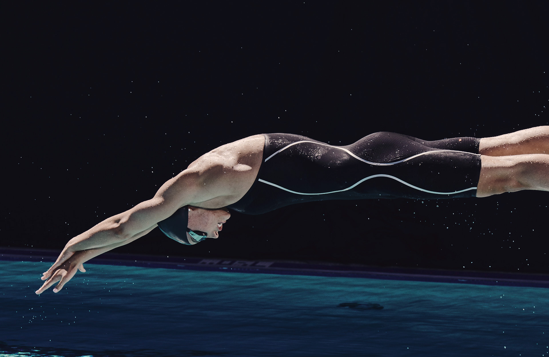
Speedo
Born in Australia in the 1920s, Speedo is one of the top-selling swimwear brands, with a presence in more than 170 countries to date. The brand's heritage of innovation stems from its leadership in competitive swimming. As a staple brand, more Olympic gold medals have been won in Speedo than any other swimwear brand, and it continues its legacy for future athletes—and, of course, influencers at the beach.
My role involved redesigning the homepage, department pages, and web design guidelines. Additionally, I
collaborated with my colleagues to improve the site’s taxonomy and enhance the user experience for its navigation.
ROLE
Senior UX/UI designer
TOOLS
Sketch, Photoshop, Invision, Figma
TEAM
Jason Lazzaro, Peter Verkilen, Dan Hsu, James Frysinger, Marcos Lopez, Casey Kettleson
YEAR
2018
CAMPAIGN
Closed
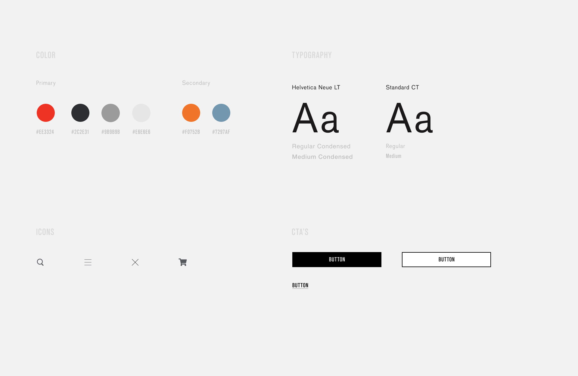
New web brand guidelines
While the brand team had guidelines, I was surprised to find that the web team did not. My designs provided a preview of new style guides and assets, including icons, for the development team to reference when redesigning the website.
When identifying elements for sales and other accents across the site, adding secondary colors to Speedo's existing palette was a valuable enhancement during promotions. By collaborating with the engineering team, we introduced new icons and button styles to elevate Speedo's overall look and feel.
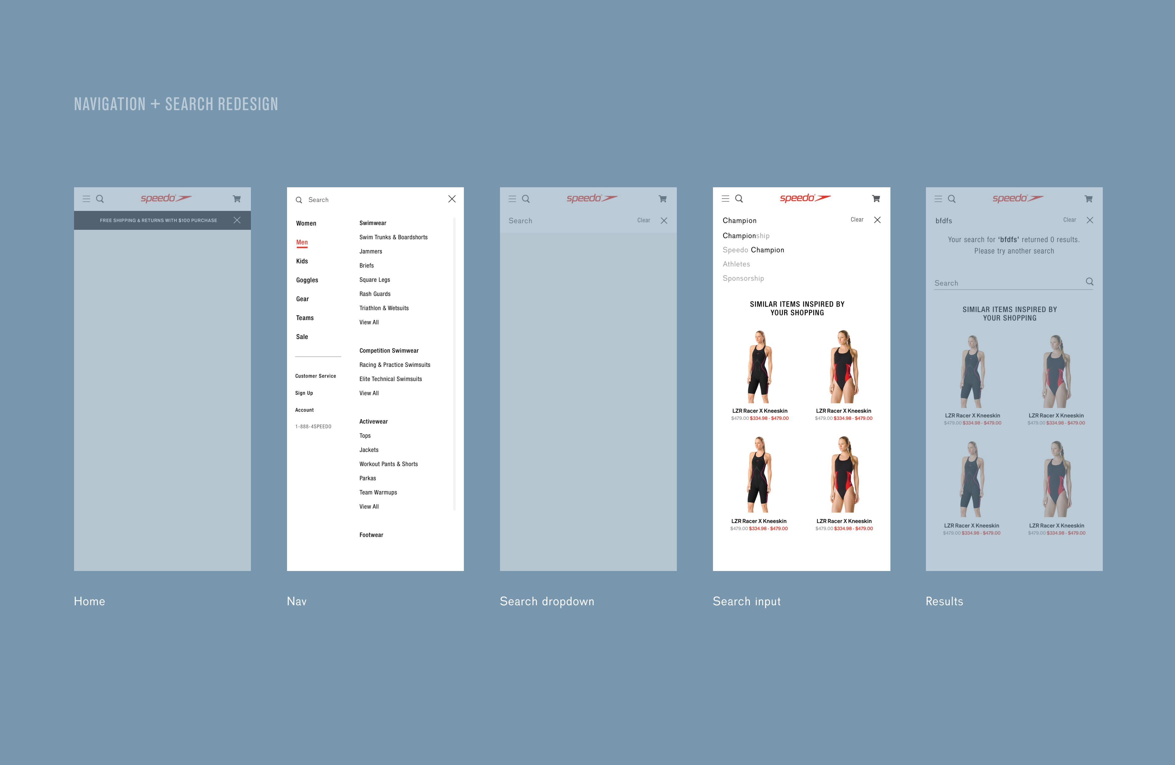
Site navigation
The navigation for Speedo was outdated and required new features tailored to the business’s needs for marketing products and driving sales. My team and I focused on improving the customer experience by conducting competitive research and analysis, taking a deep dive into identifying areas for improvement.
My responsibilities included redesigning the navigation, homepage, and department landing pages. Fortunately, Speedo had a state-of-the-art asset library, and I thoroughly enjoyed exploring its archives—a challenge I had faced at previous companies due to limited resources. One key issue I identified was the use of small images, despite the photographs containing intricate details. The site was in urgent need of attention. It was built on a traditional framework where images were confined to small spaces, preventing users from fully appreciating the product details. This became a top priority for improvement.
Data also revealed that the navigation was underperforming in areas like accessories and goggles, which were among our best-selling products. Consequently, goggles became its own parent category, and we changed the term "accessories" to "gear" to align with industry standards.
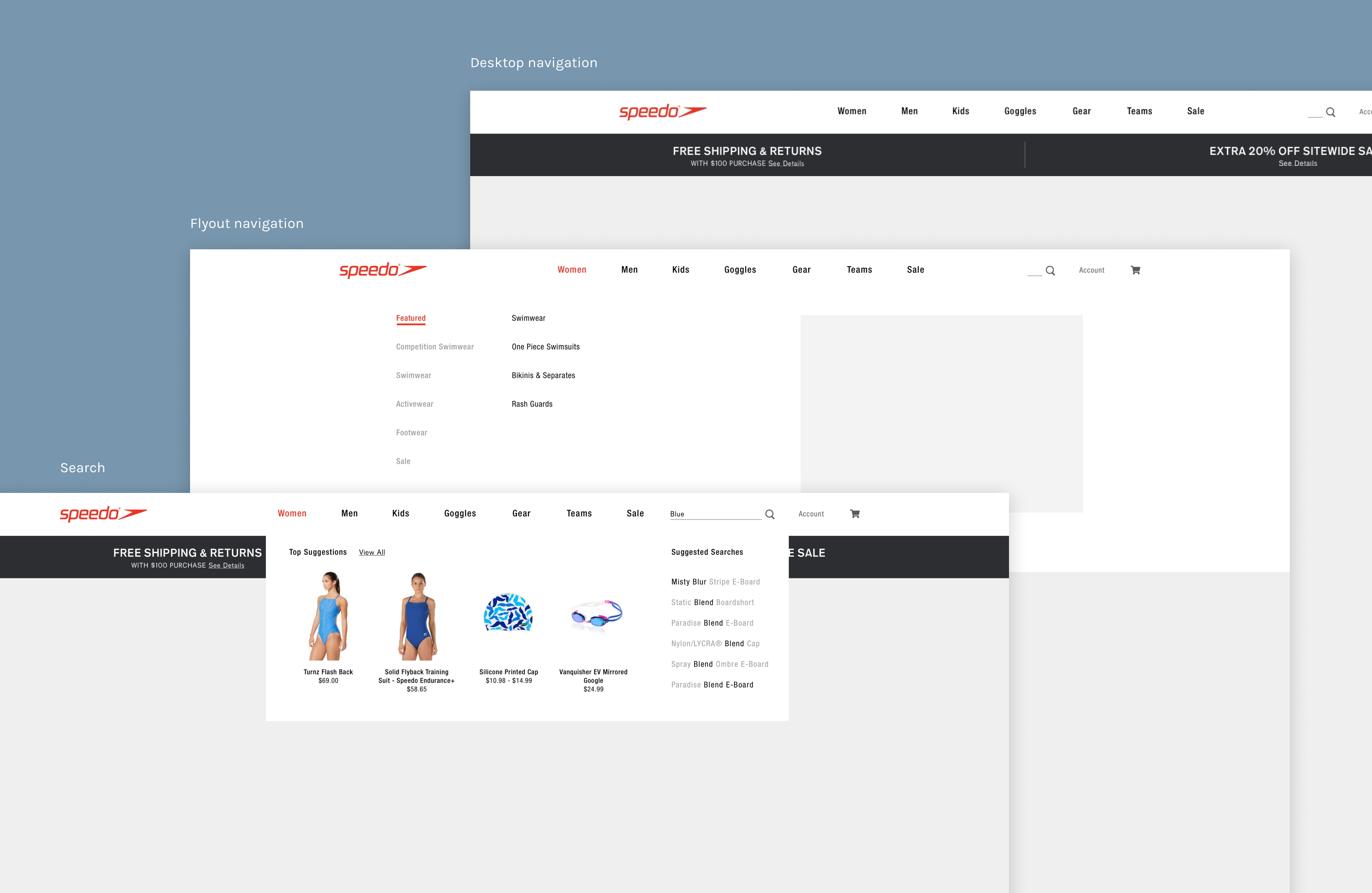
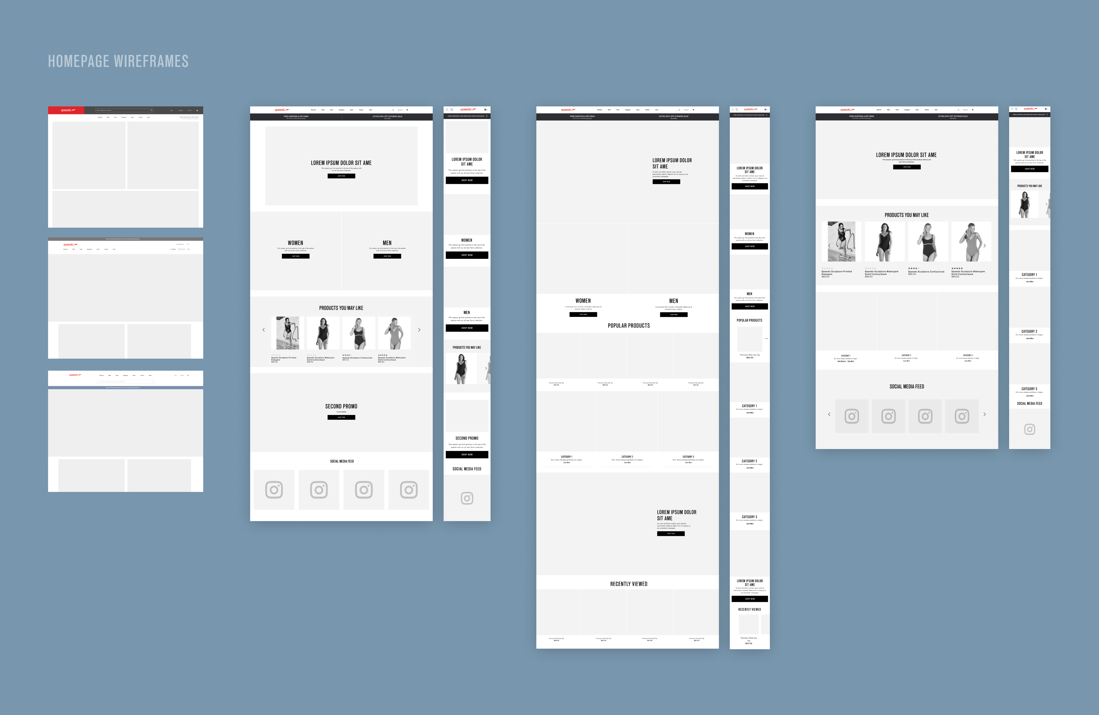
Onto the redesign - Sketches & Wireframes
During brainstorming meetings, exchanging ideas with the team helped me identify the major pain points and understand what was achievable. Each member provided insights into the restrictions and current processes before we moved on to the visual mechanics.
Design
After distilling the research and identifying areas that needed improvement, I created low-fidelity wireframes using Sketch and Miro to quickly iterate through design options. Time was of the essence, as Speedo operated in a fast-paced environment, and their marketing team, which planned quarterly, was in high demand for future projects. Collaborating with the Creative Director, Web, and Marketing teams, we used the wireframes to discuss product strategy, aligning business goals with project timelines to meet deadlines before launching the redesign.
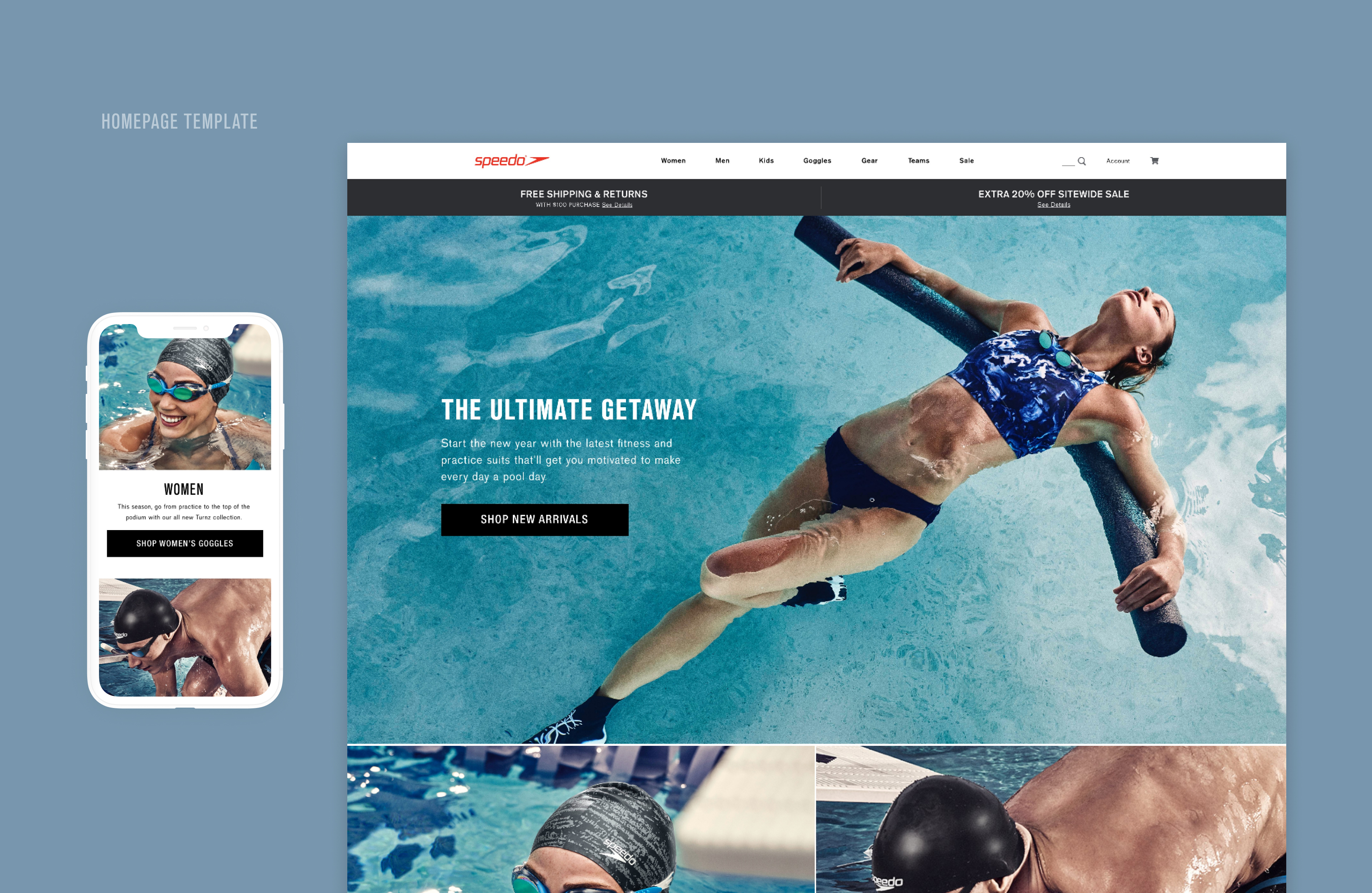
Homepage
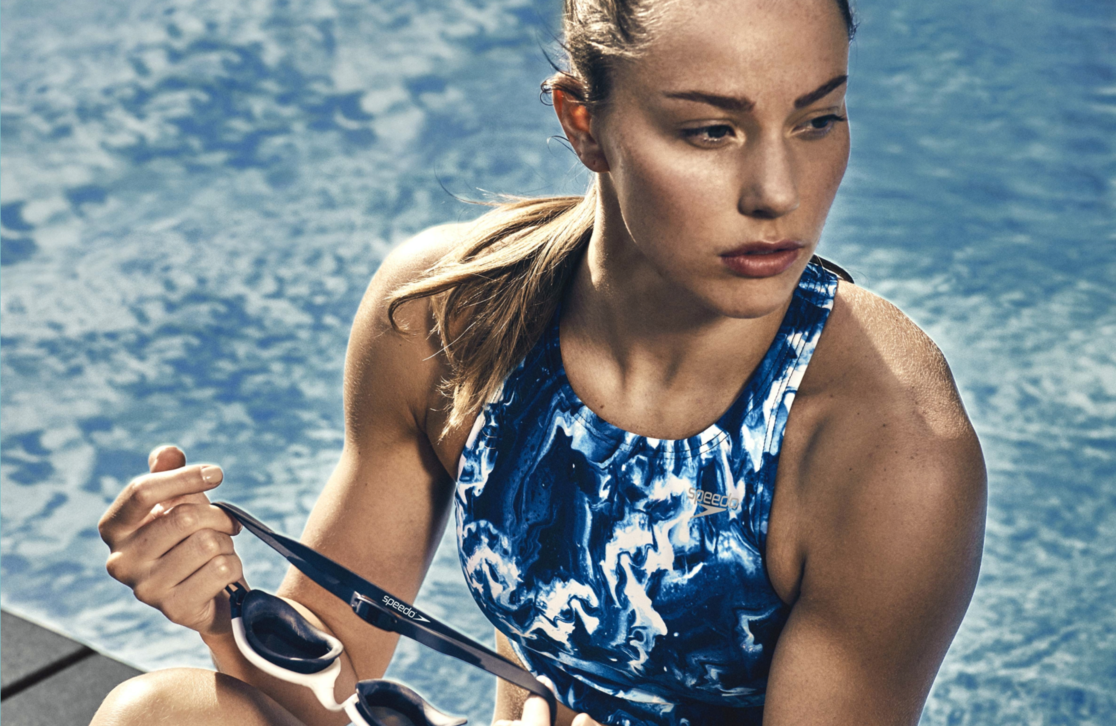
The homepage now features beautiful imagery provided by Speedo, creating a significant impact on the newly redesigned pages. Products are clearly highlighted, and the flow of the pages is easier to navigate as users scroll through the content.
Speedo's audience is highly engaged with goggles, similar to their interest in swimwear. Data revealed that users prefer seeing athletes and video content to better understand the products, with these role models influencing their purchase decisions through their interactions. Based on this insight, we decided to add videos to the homepage to engage users and encourage them to explore our enhanced product detail pages.
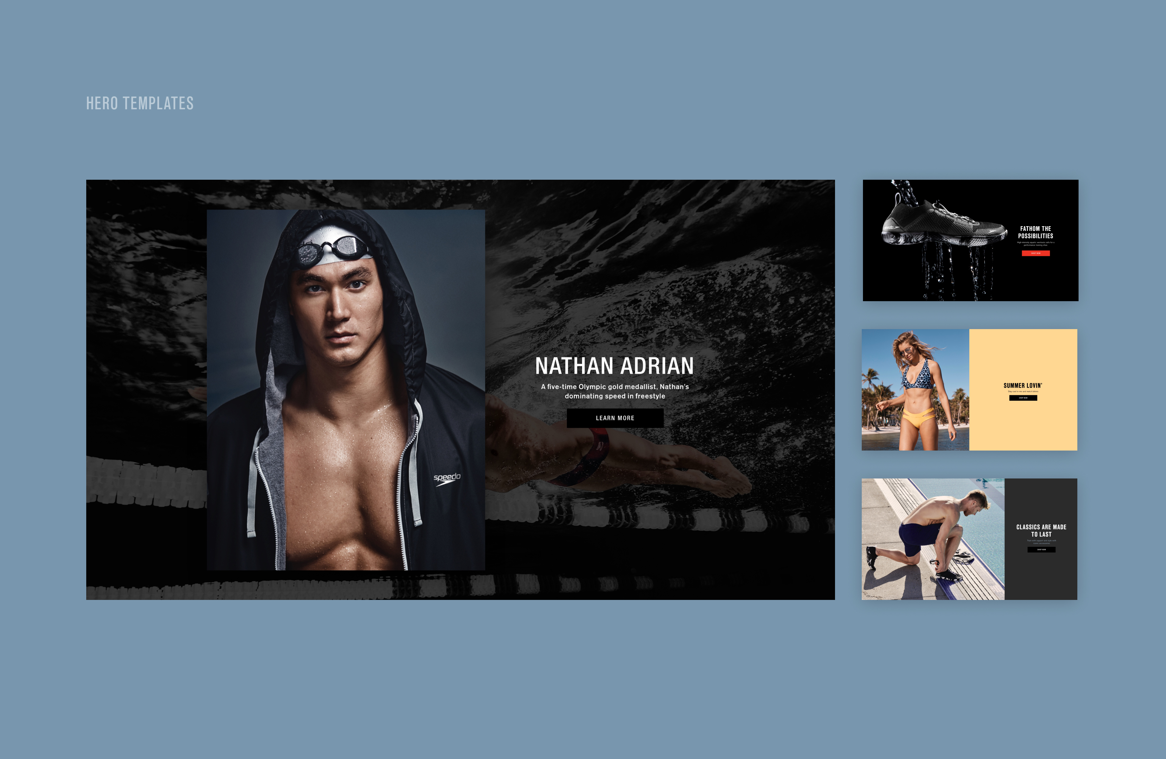
Department Landing Pages
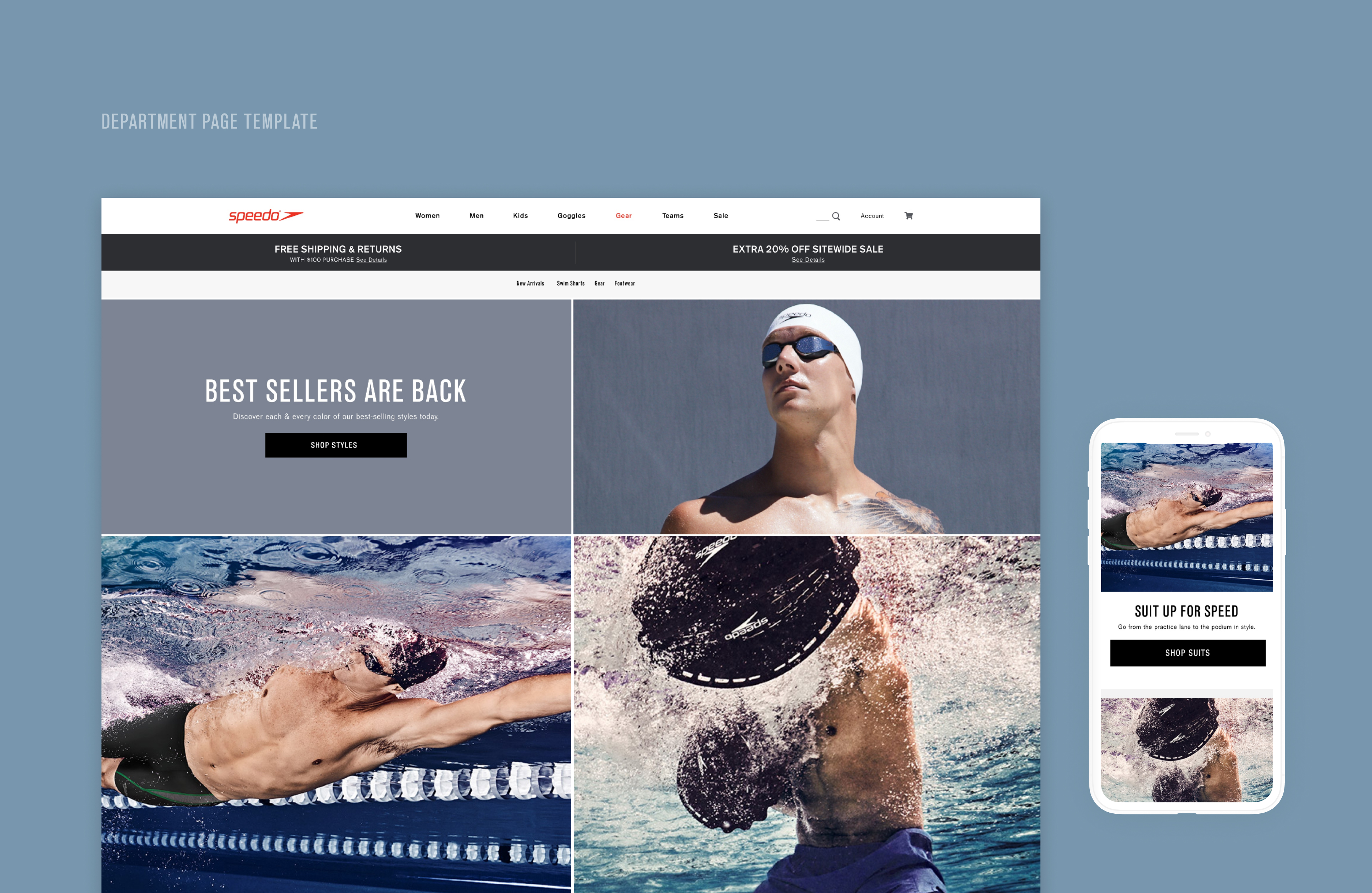
When designing these pages, I had to ensure that the desktop layout would translate seamlessly to mobile, considering the large volume of products and content. With all the major departments in mind, I developed a template that could be applied consistently across all pages. Speedo also required marketing-driven material and sales messaging to support ongoing promotions. The tiles were designed to showcase the impactful imagery Speedo consistently captured for their campaigns, prominently displayed above the fold. One of the advantages of working with Speedo was the availability of beautiful creative assets that helped tell a story and entice users to explore their products.
Reflections & learnings
I was both excited and nervous about these projects. Excited because I was doing something I love, and nervous because I knew the level of detail required would make this a complex, high-pressure project. Despite the anxiety creeping in as deadlines approached, I recognized this as the perfect opportunity to sharpen my design skills by pushing through the challenges of the process. These projects often reminded me of Frank Chimero’s adage: “People ignore design that ignores people.” I truly enjoyed working on this project with my team, and I hope you enjoyed reading about it too.
ZyroAI consumer and brand platform
KeepsBrand refresh for a mens hair loss company
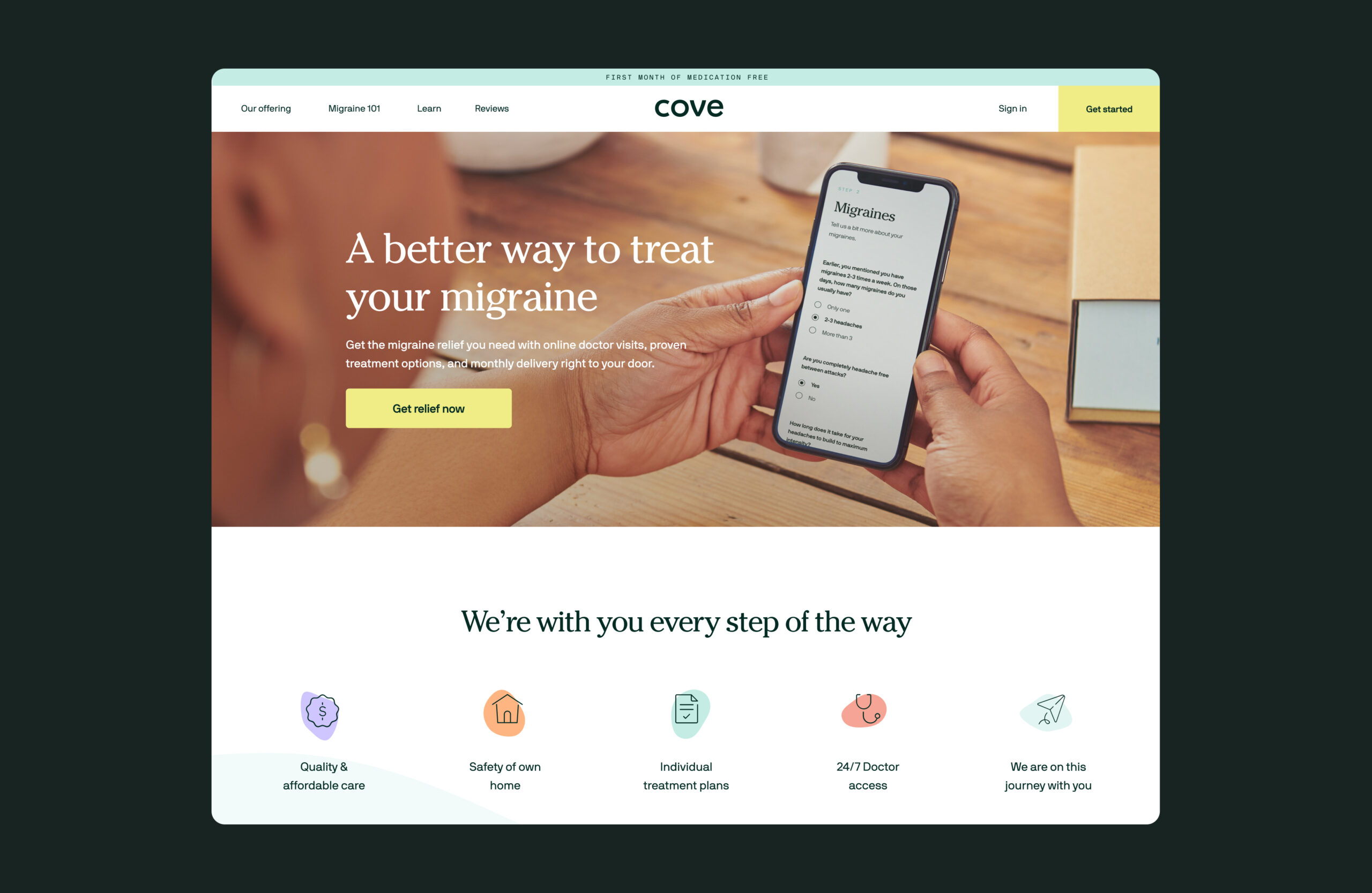
CoveRedesign for a migraine company
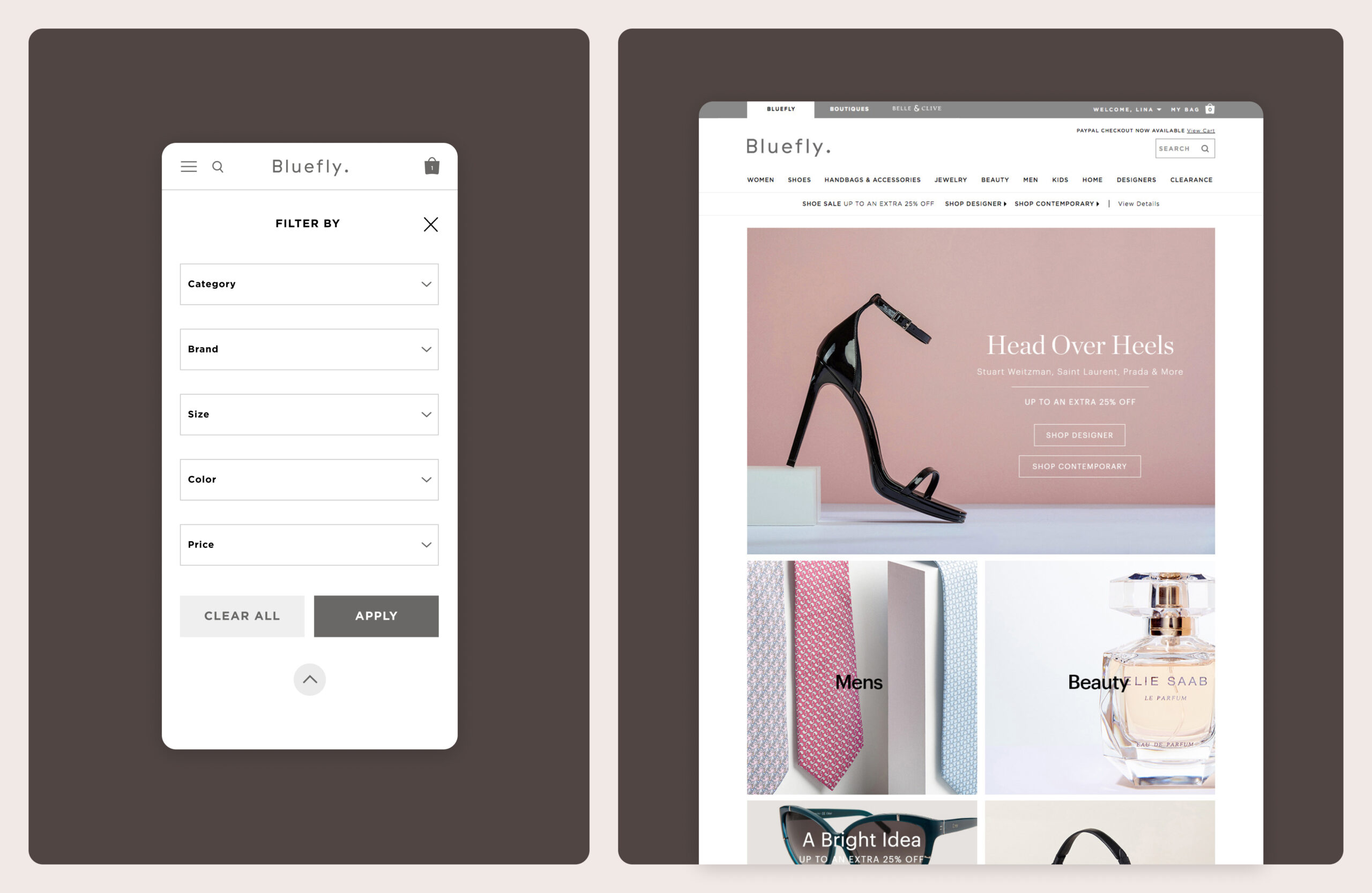
BlueflyFashion ecommerce redesign

Nectar SleepProject type

Tayne Law GroupRedesign for a law firm

Joséphine CosmeticsProject type
Via GelatoProject type

Kenneth ColeProject type
© Lina Yang. All Rights Reserved.
