Keeps
Two friends. One shared problem. A lot more hair.
Keeps started as a search for better hair-loss solutions and became the largest DTC brand in the hair loss space making treatment affordable, accessible, and way less awkward. Keeps set the bar for men’s telehealth while others followed. Now it’s the original name in hair loss, trusted by 1M+ hairlines and counting.
I designed key conversion surfaces across the product—product detail pages, marketing landers, the quiz funnel, and cart—driving more views and helping users choose Keeps over competitors. I also helped launch new products, from shampoo and pomade to a topical finasteride-minoxidil combo, expanding the brand beyond just prescriptions.
Design Challenge
As Keeps scaled, its acquisition and conversion surfaces lagged behind best-in-class DTC experiences, creating drop-offs across quiz, PDP, and checkout.
ROLE
Senior product designer
YEAR
2020-2023
CAMPAIGN
PDP experimentation
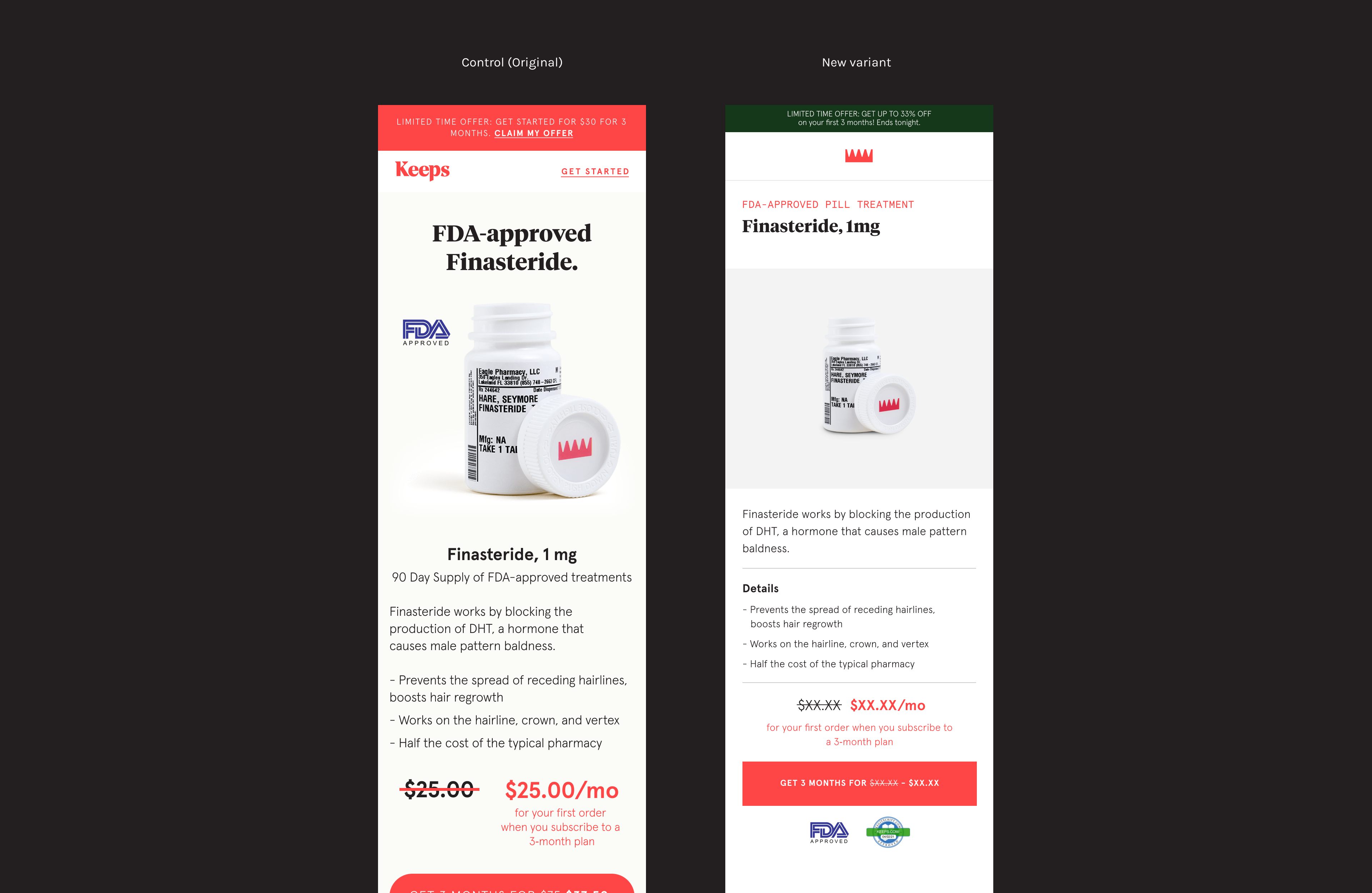
As shown above, the differences between the two variants were evident from the testing. The new design resulted in a slight increase of about 1% in session-to-lead conversions compared to the original. However, there was a decline in lead-to-purchase sales when analyzing the data.
Design changes
The original design was visually louder and inconsistent in comparison to the new design on the right, but seemed a bit messy with all the content floating around. Subtle design changes included shifting the copy to align left, making the CTA button higher up on mobile devices, adding a section for trusted badges underneath the call to action and changing the copy to be more digestible were small improvements.
Conclusion & next steps:
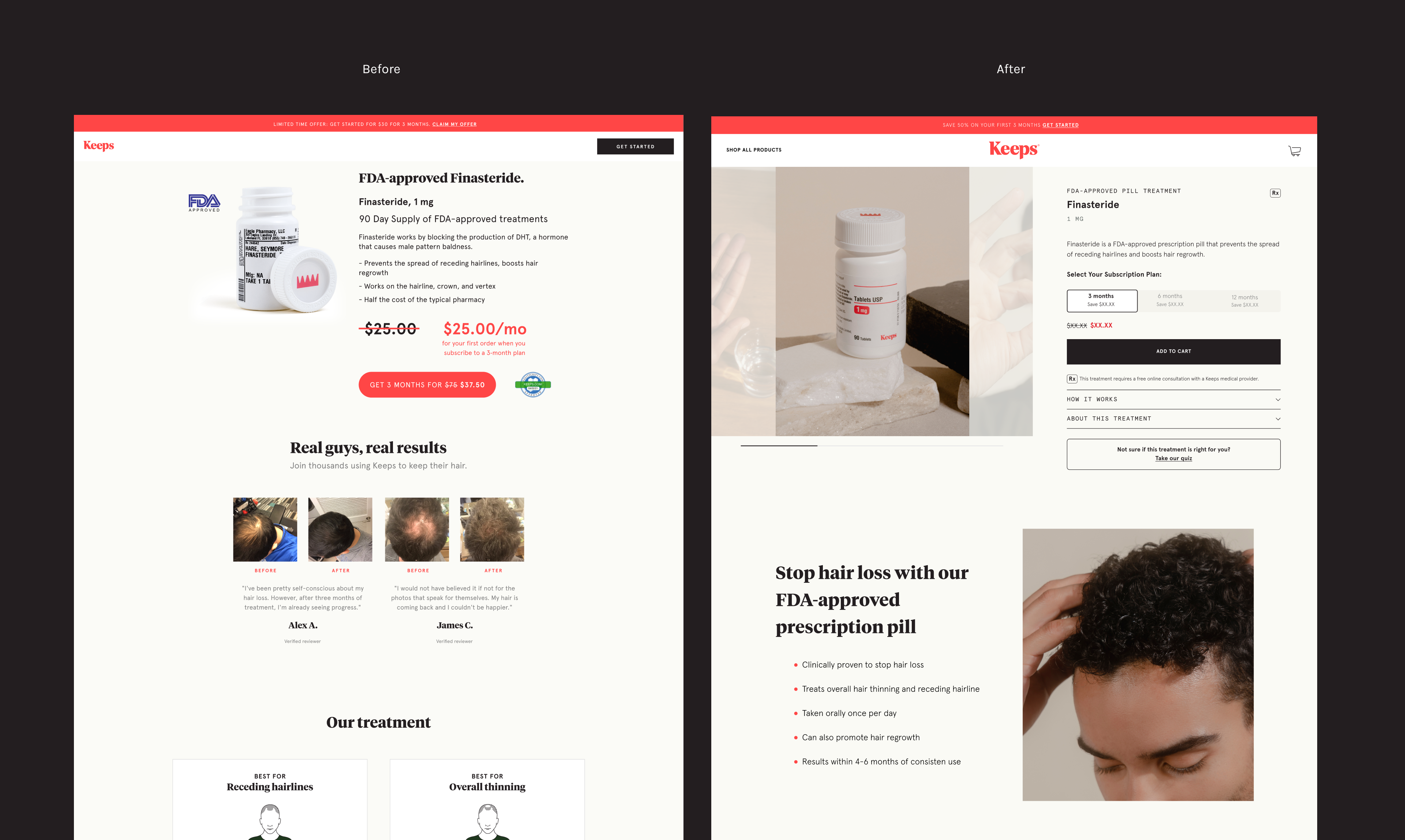
- While the product module variant saw only a slight increase in session-to-lead conversion, we believe this variation is more aligned with PDP best practices and better reflects the current brand experience.
- To conclude, we updated all of our 1-month product detail pages and rolled out the new variant.
Finalizing the product details page launch
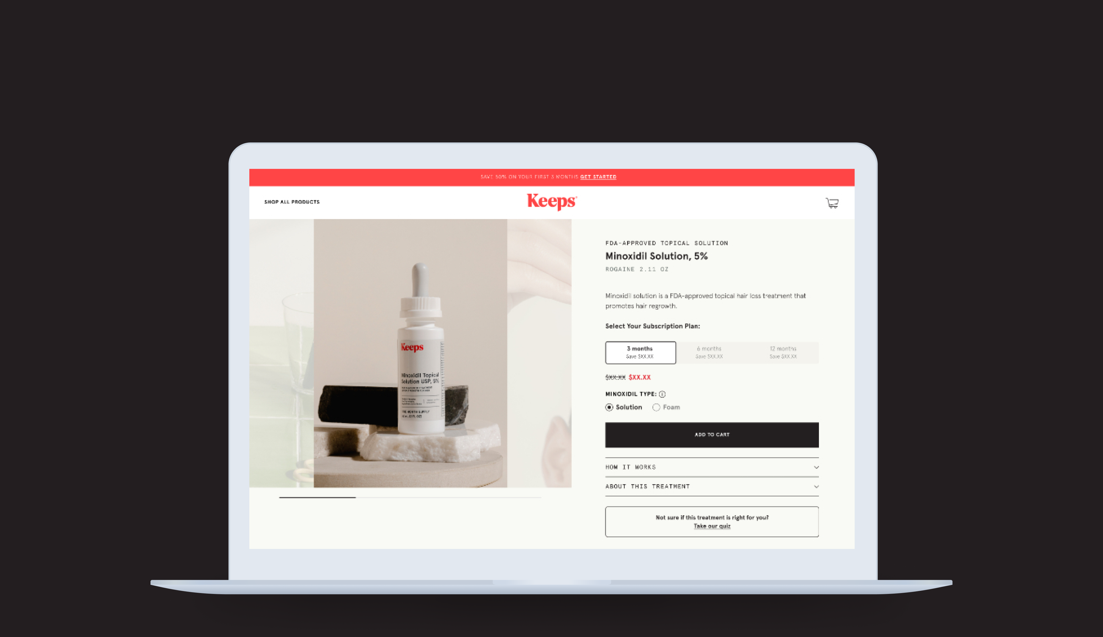
As we migrated our legacy platform, we decided to finally allocate time to build our long-overdue product detail pages. Product detail pages are key in the eCommerce world and were crucial for the business. At Keeps, there were many limitations that prevented us from achieving what we wanted, especially when users compared our products to other fully developed brands.
Collaborating with the marketing, brand, and engineering teams, we recognized that building these pages was essential to promote brand trust, provide patient education based on their needs, and much more.
Customer journey
While tailoring products in the mini quiz, there weren't any expectation settings to reassure to continue purchase. Educational information was lacking and patients were limited to personalizing their cart items. The simple solution was to add new features so that patients are able to personalize their purchase experience and complete consultation forms to check out.
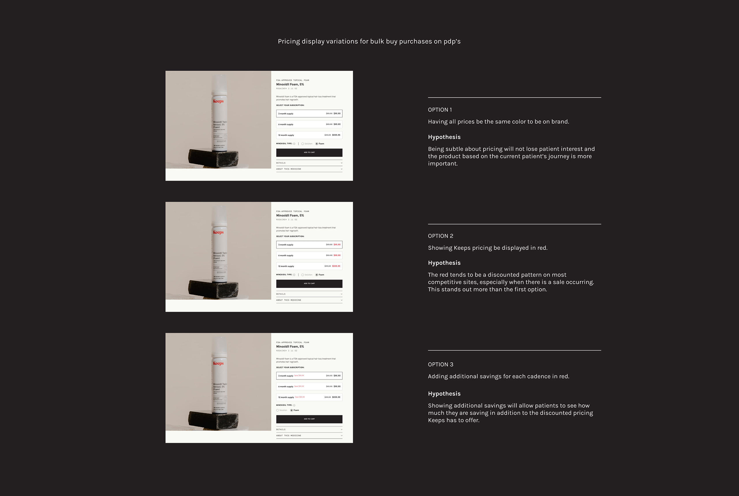
Bulk buy purchases
Data showed that retention is inherently higher for patients who sign up for a monthly plan subscription. At this entrypoint, promoting bulk buy for the most qualified patients at initial acquisition was key.
Lower offers
Patients acquired with steep first purchase offers often have high cancellation rates. Testing lower offers to see if it would help conversion and retention goals to balance each other out was the next step.
Setting expectations
We knew patients cancel due to mismatched expectations on hair growth goals so another test goal was to better capture expectations and educational benefits upfront.
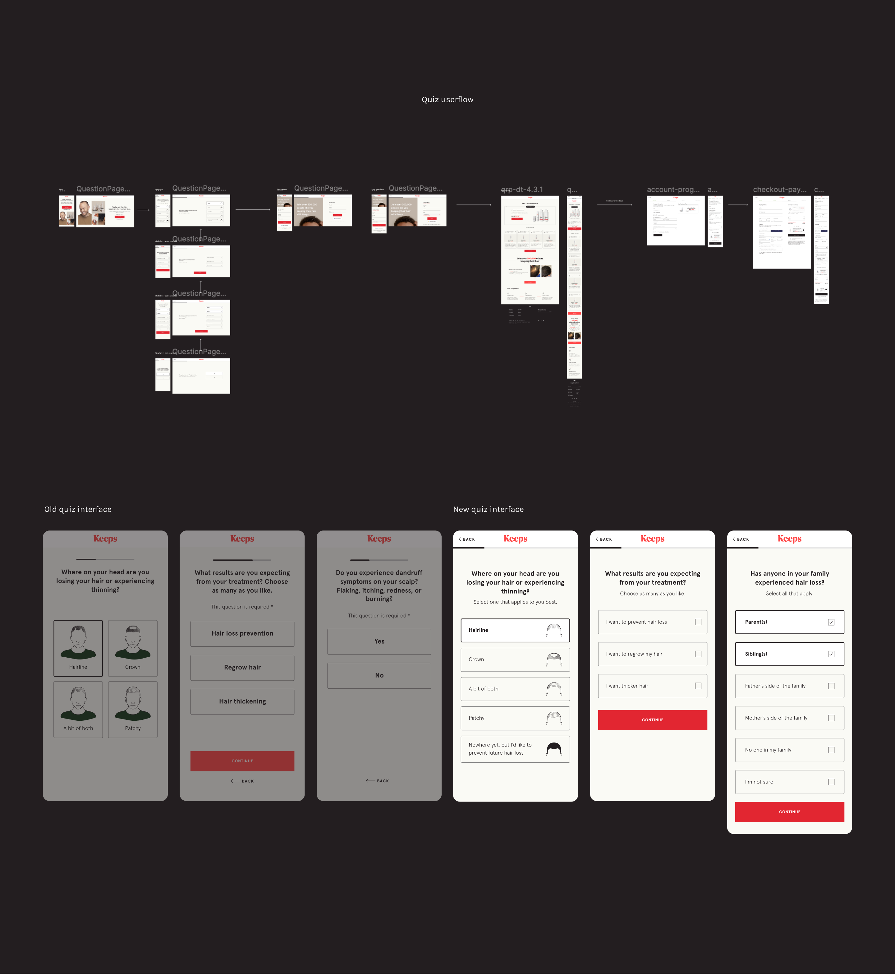
Why we built the mini quiz
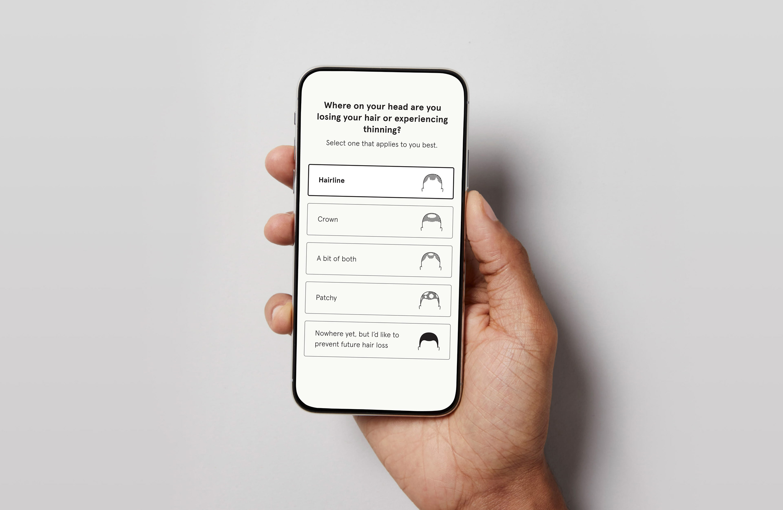
The mini quiz used by Keeps to distinguish its offerings from competitors like Roman and forHims shows an effective approach to personalized marketing and user engagement. Initially launched on Facebook to gauge user interest, this was followed by a more structured survey via Survey Monkey. The results from this survey confirmed that the quiz not only engaged users but also successfully converted them into leads.
Since users were willing to participate in the quiz and go through a consultation process, it made sense to integrate this framework into the platform, as it had been validated as a valuable user experience tool for attracting and retaining potential customers. By building this on the platform, Keeps can continue to deliver personalized solutions while clearly differentiating itself from competitors.
The problem
One of the main recurring issues users encountered after finding a Keeps product online, either through a Google search or directly on our site, was being redirected to the "Get Started" plan page or sent straight to checkout. This undermined brand trust, as users were often discouraged when they were taken directly to checkout without first seeing a cart. What if they wanted to explore more details or browse other Keeps products? What if they preferred to add specific items of their choice rather than being guided by recommendations, without proceeding to checkout immediately? At this stage, users still needed to feel confident about their purchase before committing. The core issue was the lack of personalization and the absence of a cart system, which hindered users from continuing with their purchase.
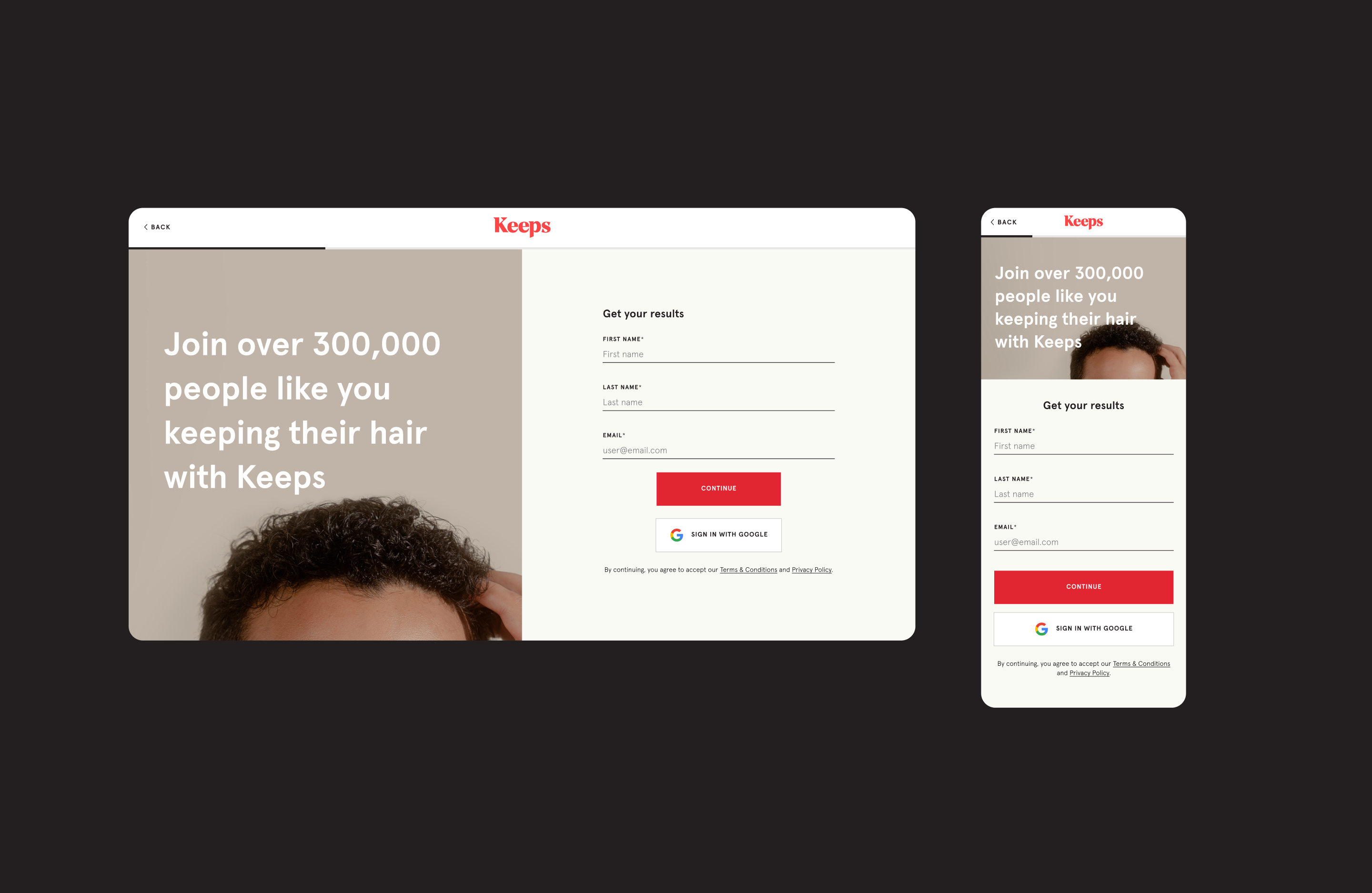
Sign up page
When conducting the mini quiz experiment, we discovered it helped capture more leads and attract additional users interested in our products at this stage of the funnel. This approach also increased the conversion rate from visitors to lead pages and from visitors to checkout when a patient signs up. The checkout experience would be seamless, with their information automatically populated.
Gating the results page with the lead step addition
Our hypothesis was that moving the lead collection page before displaying recommendations would increase the conversion of visitors to leads. Patients would be more inclined to sign up to view their results, and ideally, this would help them decide whether to make a purchase.
Results
This test proved to be statistically significant and is now live on the Keeps site. Future experiments will focus on testing various product recommendations, updating images, refining copy, and iterating on designs to drive further improvements.
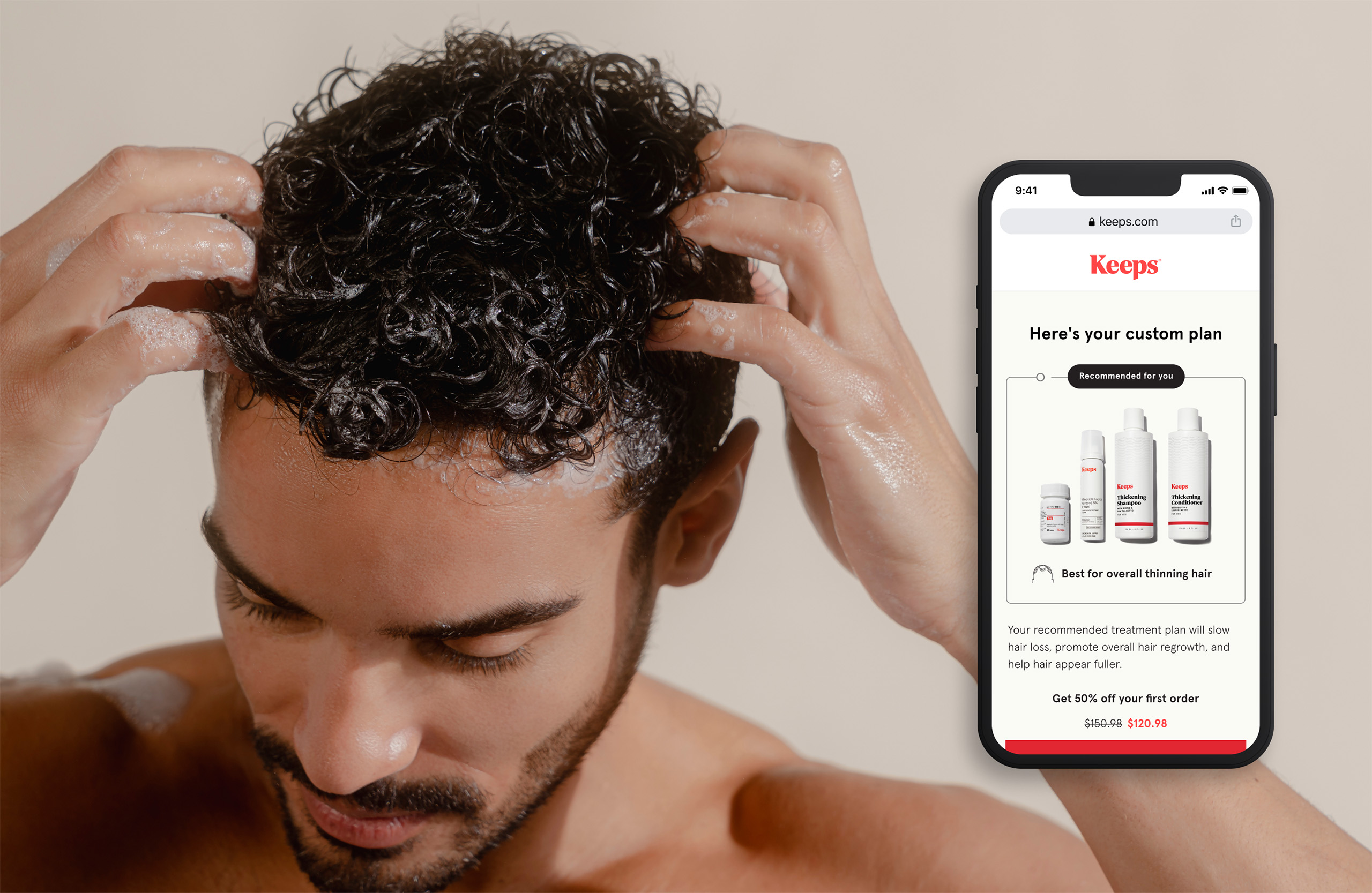
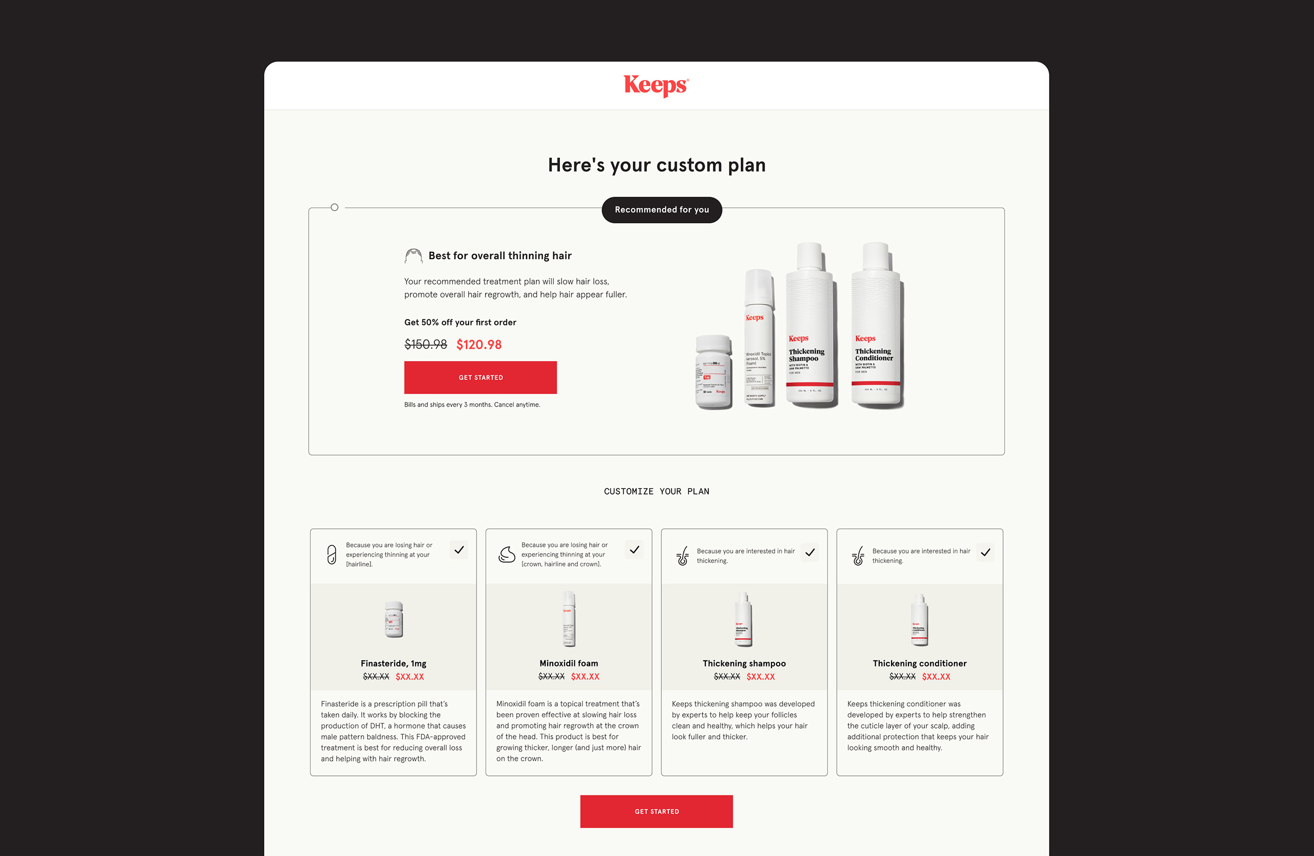
Keeps quiz results page
To enhance the experience, the recommendations are personalized to the user. The Keeps team and I launched a custom plan page where you can select items to be added or removed depending on your results. Another added feature was a new slot where we can dedicate a module for new product exposure.
Design process
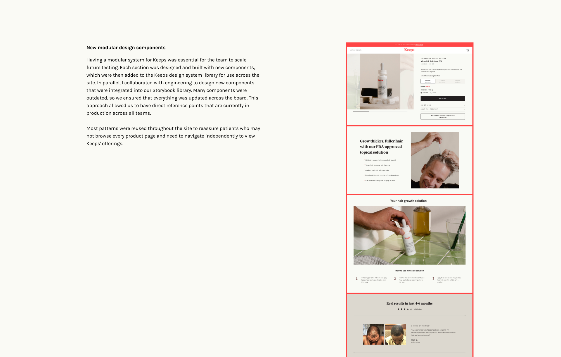
After multiple iterations, the team and I selected this model as the starting point. The designs you see above are newly built components based on the rebrand and have been added to the Keeps design system library. Updates included new images from the most recent photoshoot, as well as the addition of iconography and copy descriptions. Throughout the process, we aimed to showcase enough products and information to enable users to make confident purchasing decisions with Keeps. Before launching, we conducted user testing to optimize both design and functionality, ensuring we addressed user feedback and needs.
Future experiments
Since this was a newly built feature added to the quiz funnel, we kept in mind that we would have to make future improvements based on customer feedback.
Long-term goals
- Support dynamic marketing content via CMS
- Support promos for brand, marketing
- Market/Customer research to re-evaluate brand messaging and content
- Implement and test new design iterations
- Add features to support product education
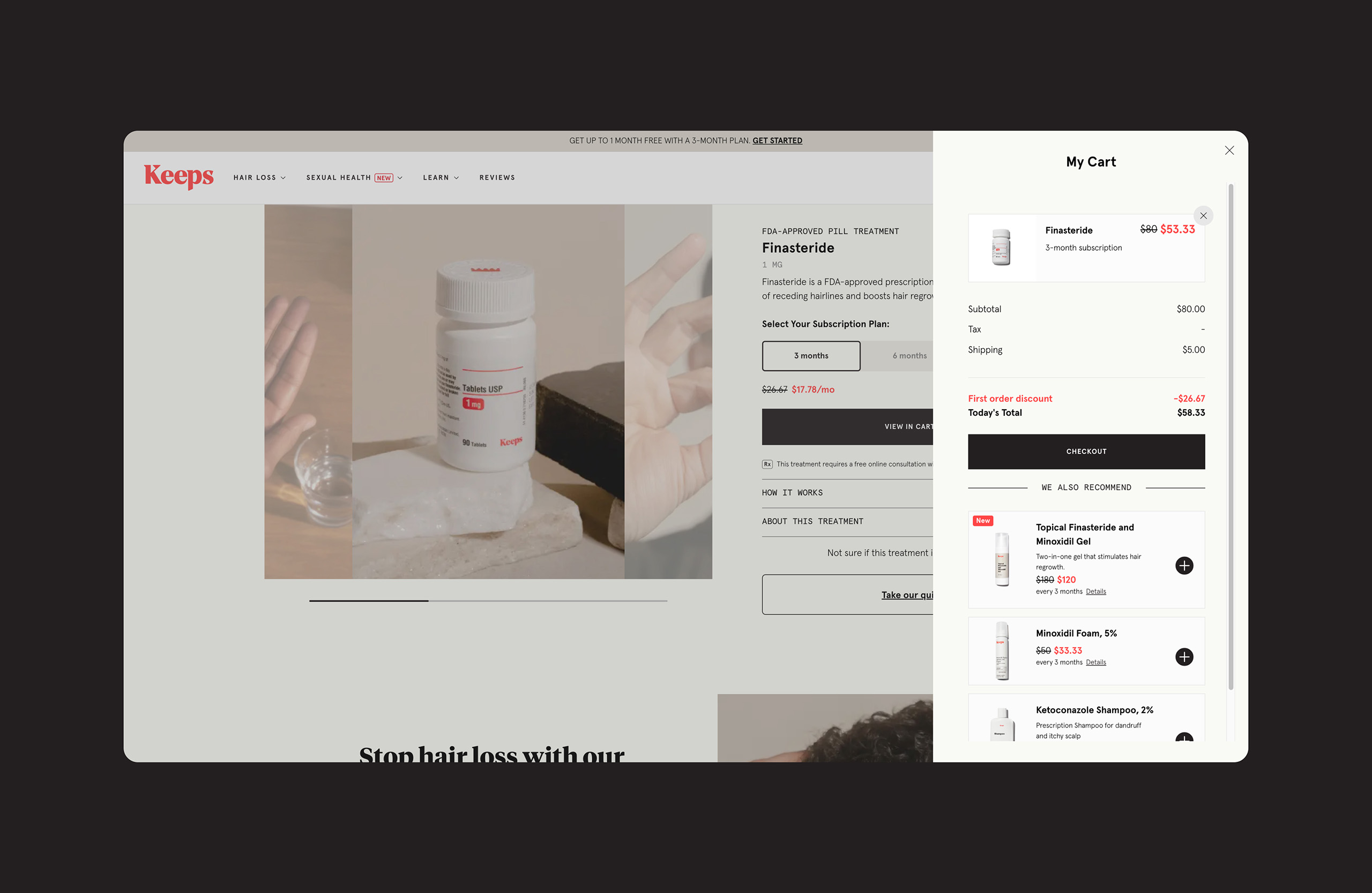
The problem
When I joined Keeps, there was no cart. Users coming from the consultation quiz were not able to see the price of the plan before reaching the checkout page, leading to a high bounce rate once they encountered the cost. Additionally, users were unable to modify the recommended treatment plan, which caused some to return to the quiz to change their answers in hopes of receiving a different recommendation.
Description
We decided to test the impact of adding a cart at checkout for LP traffic to determine if it will increase checkout to purchase rate and overall site-to-purchase performance. This test is in response to a significant drop in the checkout-to-purchase conversion rate for paid traffic.
To address this issue, we needed to incorporate a cart at the checkout stage, giving prospects the flexibility to modify or customize their plan before finalizing the purchase. Currently, users coming from the mini quiz are not seeing the plan price until they reach the checkout page, leading to high bounce rates. Additionally, many users are returning to the quiz to change their answers in an attempt to receive a different treatment recommendation, which may be contributing to the drop-off.
Hypothesis
Introducing a cart mechanism at checkout will allow users coming from landing pages to easily modify their plan at the point of purchase. By offering greater flexibility and confidence in customization, we project that the overall site-to-purchase conversion rate will increase by 5%.
Future iterations for improvement
- Allow users to see dynamic product recommendations when cart is empty
- Add promotional messaging, discounts and details
- Announce cart actions
- Allow seamless checkout for account users
© Lina Yang. All Rights Reserved.